
If toned Kallitypes can't be distinguished from Pt/Pd prints, why is it unreasonable to think that a lot of Kallitypes might have been mis-identified as the (much more common) Pt/Pd prints?


If toned Kallitypes can't be distinguished from Pt/Pd prints, why is it unreasonable to think that a lot of Kallitypes might have been mis-identified as the (much more common) Pt/Pd prints?
Originally Posted by tgtaylor

The kallitype process was very popular from the time of its introduction in the late 19th century until at least 1940. In the popular literature on photography in that period there are literally hundreds of articles on the process, which to me clearly suggest it was in wide use. Dick Steven's book, Making Kallitypes: A Definitive Guide, published in 1993, has a bibliography of ten pages that includes both articles and books about the kallitype, most publlshed in the period 1890-1970.
I am not able to explain why more prints labeled as kallitypes are not found in collections, but I tend to agree with the opinions already offered that many of them have faded due to improper processing, and that some of them that have survived were toned with pt/pd and have survived as pt/pd prints.
Sandy
For discussion and information about carbon transfer please visit the carbon group at groups.io
[url]https://groups.io/g/carbon

Most people are honest, not all of course, but most are, which leads me to conclude that kallitypes being deliberately mislabeled as pt/pd or something else is not the reason for their absence in collections. I am currently reading Stevens 2013 Kallitype: The Process and the History. In it he suggest that a lot of the turn of the century articles published on the kallitype were simply copy-cat articles from other journals of the time and not necessarily an indication of the popularity or wide spread use of the the process.
That said, there does appear to be a mis-identification of process type in certain collections. For example, Louis Fleckenstein http://historiccamera.com/cgi-bin/li...et&app_id=2121 was an important American pictoralists and Kallitypists and a significant body of his work can be viewed online: http://www.getty.edu/art/collection/...can-1866-1943/. Many of these works appear to me to be kallitypes but are labeled by the Getty as "Toned gelatin silver print." Could it be that most prints back in those days were not labeled with the process used and those labels were subsequently applied by the collection curators who probably never even heard of the kallitype?
Thomas
Wildcat Fall - Yosemite national Park, 2016.
This is a reprint of the image posted in #16 above. That print was printed too light and darkened in the scan. This print is much better and the scan is true. Printing a kallitype you are looking for a faint image (a" stage wisper") on the exposure but this image was shot in low ambient lighting and required a deeper printing. I gave it 8 minutes in the shade and ~ 4 minutes in the sun. As before, split-toned with gold for a black tonality. Looks great up-close in the light station.
Thomas
We may of crossed paths, taken on May 7th 2016 on Pentax 67. Scanned and digital negative to a 8x10 Kallitype. Bergger Cot320, Ag toned.
simple phone image for fun
Last edited by SMBooth; 7-Jul-2016 at 00:59. Reason: image upside down...
Cheers Shane
SMBooth - why tone a kallitype whichis already a silver print, with silver? Does it change the color,or make it more stable?
I think he meant to type Au instead of Ag.
Yesterday the PO delivered a pack of Hahnemühle Platinum Rag that I bought to try out. I took a quick peek and it looks almost identical with the Bergger except that its more difficult to distinguish between the front and the backside. B&H has it misfiled with the inkjet media.
Thomas
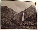
Yosemite Falls & Merced - Yosemite National Park, 2016.
Palladium-toned Kallitype printed on Bergger Cot-320, 610mm Apo-Nikkor.
Thomas
Really, i find the Bergger Cot320 to have a real mechanical pattern on the front. The Hahn Rag is much nicer.
Yes Au (Gold) not Ag...
Cheers Shane
This is a bit off topic, but a few weeks ago I was flying from Albuquerque to San Francisco in the late afternoon. I was on the right side of the plane, and at one piont found myself looking right down at Yosemite Falls, then El Capitan. I love flying when I can see nice places I've been.
 Posting Permissions

 Reply With Quote

Bookmarks