
Fair enough, Christopher. I agree that the second and third images are more interesting than the first, but I find little to fault in any of them. Very well done!


Fair enough, Christopher. I agree that the second and third images are more interesting than the first, but I find little to fault in any of them. Very well done!
The middle one is my favourite - I think because of it's simplicity but the problem is like so many times do I really know why? Why is it that somebody likes paintings like Van Goghs, gets goosebumps from certain classical music pieces? I think there's a lot of unconscience stuff going on aswell.
I like the last one aswell but if I may a cropped version, don't know why again :-) perhaps it's just 3 circles and 3 lines then...?
Tom Keymeulen

i like the 3rd image, i enjoy close ups and abstracts, images like the 2nd and 3rd one make good contact prints
"WOW! Now thats a big camera. By the way, how many megapixels is that thing?"
OK, I throw myself before the wolfs here:
Covered bridge in North Carolina.
127mm lens 4x5 speed graphic
Two flash bulbs used to light the interior.

That's the spirit! Lovely subject but I think you could treat it better. I really don't care for the angle of light you've used. It's too frontal. Have you tried this same thing with natural light? Often a long corridor like this can look really lovely with that direction of light skipping off all the surfaces from the far opening. The other problem created with that light is the hot spots on each side. I find it pulling my look out of the picture entirely.Originally Posted by Kav

Perhaps there is a light leak, or the scan was uneven: note the film edge density on bottom versus top: there's a gradient from black to gray.
Last edited by Ken Lee; 6-Jan-2013 at 16:00.
Interesting take one it. I went with the flash bulbs to try and show all of the griffti in the bridge, and to try and even out the exposure so the light at the end of it was not so blown out.
I do agree that sticking with natural lighting can have a drastic impact on a photo like this one, but I did some digital proof shots with only using natural light and did not like it.
Interior of a CH-53E helicopter
90mm on a Speed Graphic
(When I enlarged it I printed it darker to reward the viewer for inspecting it closer, also it makes it much more foreboding)
I had never noticed that. I will look into it. Thank you for pointing that out.
On the helicopter, can you burn in the near window on the left, and the windscreen at the front? As you point out, there is a lot of detail to enjoy, but those two hotspots keep dragging my eye to them.
In fairness to Ken, I think he started a thread like this long ago. I look forward to contributing something the next time I develop some negs.
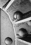
Now about those three bolt heads...
Photographers seem to have a real thing about not having things right on the edge of an image like that. I bought into it until I saw the work of the painter Clyfford Still. Google him under images and look at some of his things. He often places something of interest right on the edge, like those three bolt heads. I tried starting a thread here asking for photographic images using that idea, but it derailed pretty quickly. Since then I have thought about trying to do what he does in photographs, but haven't really found a situation where it worked for me.
So like like the left side of #3, but would like the bottom bolt head to have some room below it. Why do I not like it touching the edge of the image, but have no problem with seeing just the edges of the other three? I don't know...
I really like the middle one. The other two are nice but don't hit me the same way as the middle one. I don't consider any of them
to be abstracts.
Mike
 Posting Permissions

 Reply With Quote


Bookmarks