Page 4 of 5 FirstFirst ... 2345 LastLast
Results 31 to 40 of 50

Thread: Making Digital negatives

  1. #31

    Join Date
    Aug 2010
    Posts
    6

    Re: Making Digital negatives

    Quote Originally Posted by Colin Graham View Post
    Hello Paul, this is very interesting news indeed. I see the dreaded dither in carbon transfers highlights on some surfaces and have been looking to explore some other options, so many thanks for posting the info, it sounds encouraging.

    Would you happen to know if the other K7 sets are as efficient at UV blocking and quick drying as the selenium set? I was thinking of dedicating a second printer to this and would be nice to make something a little warmer do double duty for negatives as well as occasional straight inkjet prints.
    Colin, From my experience at my studio the U.V blocking of the selenium set is greater by around 15% - 20% than traditional silver film. Some of that is the base of the Pictorico. I can not speak about the durability or other characteristics of the warmer set. I only have experience with the selenium set.

    Mark Nelson told me that someone out there doing carbon had found the perfect color combination working with spectral density that minimized to perfection or near perfection the "dreaded dither"

    Again - if the order of the ink overlap can be reversed in QTR the dither problem that some are having with carbon and other glossy based processes that require a negative could very well evaporate.

    Paul Taylor

  2. #32

    Join Date
    Dec 2009
    Location
    Topsham, Vermont
    Posts
    48

    Re: Making Digital negatives

    Paul,

    I am trying to wrap my head around this. I think I am reading that you are wishing the inks to overlap themselves as the ink density on the film gets darker and darker. That is how a Piezography K7 curve works - rather than the other way around. The greater number of overlaps are as the inks get darker...

    Can you verify if you are using a process that is opposite to this? In other words, are you starting by building the black, and then building curves towards the lightest shade?

    Jon


    Quote Originally Posted by Paul T. View Post

    Again - if the order of the ink overlap can be reversed in QTR the dither problem that some are having with carbon and other glossy based processes that require a negative could very well evaporate.

    Paul Taylor

  3. #33

    Join Date
    Dec 2009
    Location
    Pacifica, CA
    Posts
    1,710

    Re: Making Digital negatives

    Hi Jon,
    I think Paul's suggesting instead of pulling in shade 1 as you get into higher negative "densities" printed on Pictorico, proportionally increase overlapping lighter inks because any shade 1 is noticeable.
    Bill

  4. #34

    Join Date
    Dec 2009
    Location
    Topsham, Vermont
    Posts
    48

    Re: Making Digital negatives

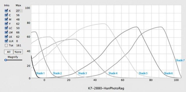
    A typical K7 curve made from the Piezography profiler has little shade 1 in comparison to shade 2, which is why I am questioning what his process is using.

    Again I will post a pic of a typical curve as I make them below and you can see that there is a small percentage of black ink shade 1 (27%), with overlaps of shade 2 (52%), shade 3 (41%), shade 4 (21%), shade 5 (13%) in the dMax - with these % of inks trailing off towards the lighter tones. The black dot is totally suppressed in a K7 curve as we make them here. You can never see a dot with the K7 curves that I supply to QTR.

    Maybe Paul will explain his process and we can try and come up with some alternative to it that is even a further improvement for him?


    Here is a link to an explanation of the Piezography QTR K7 curve architecture that may be helpful to those who are trying to use their own methodology (which may be reversed to how I work.)

    Jon Cone
    Piezography


    Quote Originally Posted by Bill Burk View Post
    Hi Jon,
    I think Paul's suggesting instead of pulling in shade 1 as you get into higher negative "densities" printed on Pictorico, proportionally increase overlapping lighter inks because any shade 1 is noticeable.
    Bill

  5. #35

    Join Date
    Sep 2003
    Location
    South Carolina
    Posts
    5,506

    Re: Making Digital negatives

    Quote Originally Posted by Paul T. View Post
    Mark Nelson told me that someone out there doing carbon had found the perfect color combination working with spectral density that minimized to perfection or near perfection the "dreaded dither"

    Paul Taylor
    Mark Nelson and I talked about this so I may be the persons you have in mind. I don't see any dither pattern in the highlights of my carbon prints. I am currently making digital negatives for carbon with an Epson 3800 using PDN and spectral density negatives of G=255, R-110 with a +10 ink setting. The Dmax of the negatives is pretty high, about log 3.0, and they print very smooth, about like large in-camera negatives.

    I tried to use QTR with the Epson 3800 but all the profiles I developed gave a grainy look using the Epson inks. PK works better than MK but neither was entirely adequate.

    The prospect of higher resolution with QTR and the K7 selenium inks is tempting but I am reluctant to give up something that is working very well for me, especially since the cost to even try the change is pretty high.

    Sandy
    For discussion and information about carbon transfer please visit the carbon group at groups.io
    [url]https://groups.io/g/carbon

  6. #36

    Join Date
    Aug 2010
    Posts
    6

    Re: Making Digital negatives

    Quote Originally Posted by joncone@cone-editions.com View Post
    Paul,

    I am trying to wrap my head around this. I think I am reading that you are wishing the inks to overlap themselves as the ink density on the film gets darker and darker. That is how a Piezography K7 curve works - rather than the other way around. The greater number of overlaps are as the inks get darker...

    Can you verify if you are using a process that is opposite to this? In other words, are you starting by building the black, and then building curves towards the lightest shade?

    Jon
    Jon - I have probably spent too much time wrapping my head on things. I was under the impression (wrong) that the ink overlaps were the greatest in the highlights and that was what was responsible for the incredibly highlight separation and smooth detail on my positives. Looking at my QTR Ink Pattern Page that is what would appear to make sense to me. I could not ask for anything more in my positives. My negatives work wonderfully for all but the shiniest surfaces where the weave of the darkest inks are sometimes apparent. Since my theory was backwards and will not work - Is there any way to reduce the slight weave (weave is my best way of describing what I see) that is apparent in the darker inks?

    Thank Paul Taylor

  7. #37

    Join Date
    Aug 2010
    Posts
    6

    Re: Making Digital negatives

    Quote Originally Posted by sanking View Post
    Mark Nelson and I talked about this so I may be the persons you have in mind. I don't see any dither pattern in the highlights of my carbon prints. I am currently making digital negatives for carbon with an Epson 3800 using PDN and spectral density negatives of G=255, R-110 with a +10 ink setting. The Dmax of the negatives is pretty high, about log 3.0, and they print very smooth, about like large in-camera negatives.

    I tried to use QTR with the Epson 3800 but all the profiles I developed gave a grainy look using the Epson inks. PK works better than MK but neither was entirely adequate.

    The prospect of higher resolution with QTR and the K7 selenium inks is tempting but I am reluctant to give up something that is working very well for me, especially since the cost to even try the change is pretty high.

    Sandy
    Sandy, Great that you found a color that gives you such wonderful results. I tried and tried and tried and gave up. Once I found that K7 worked for me I abandoned spectral density and have never done comparative resolutions tests.

    Paul

  8. #38

    Join Date
    Dec 2009
    Location
    Topsham, Vermont
    Posts
    48

    Re: Making Digital negatives

    E-mail me your QTR curve and let me take a look at it.

    best,

    Jon


    Quote Originally Posted by Paul T. View Post
    Jon - I have probably spent too much time wrapping my head on things. I was under the impression (wrong) that the ink overlaps were the greatest in the highlights and that was what was responsible for the incredibly highlight separation and smooth detail on my positives. Looking at my QTR Ink Pattern Page that is what would appear to make sense to me. I could not ask for anything more in my positives. My negatives work wonderfully for all but the shiniest surfaces where the weave of the darkest inks are sometimes apparent. Since my theory was backwards and will not work - Is there any way to reduce the slight weave (weave is my best way of describing what I see) that is apparent in the darker inks?

    Thank Paul Taylor

  9. #39

    Join Date
    Sep 2003
    Location
    South Carolina
    Posts
    5,506

    Re: Making Digital negatives

    Quote Originally Posted by joncone@cone-editions.com View Post
    Sandy,

    I formulate only two non-matte compatible Piezography ink sets and those are Piezography K7 Warm Neutral and Piezography K7 Selenium. The shade 1 black you would use would be MPS Black, rather than K7 shade 1 which is our matte black. Shades 2 through 7 go from very very dark to very very light.

    Jon Cone
    Piezography
    Jon,

    Just making sure I understand this. I would use the Piezography K7 Warm Neutral or Selenium set for printing on Pictorico, with shade 1 the MPS black.

    Could I also print on matte papers with either set with the MPS black, or would I need to substitute matte black?

    Sandy King
    For discussion and information about carbon transfer please visit the carbon group at groups.io
    [url]https://groups.io/g/carbon

  10. #40

    Join Date
    Dec 2009
    Location
    Topsham, Vermont
    Posts
    48

    Re: Making Digital negatives

    Sandy,

    Yes, Warm Neutral and Selenium both are formulated to adhere to non-matte surfaces.

    You could print on matte paper with the MPS black option, but the dMax would be reduced (similarly to printing with a Photo Black on matte paper.) For best Piezography matte results, you would want to switch to the matte black. We have one matte black of all of the various Piezography ink sets. We call it K7 shade 1.

    Jon

    Quote Originally Posted by sanking View Post
    Jon,

    Just making sure I understand this. I would use the Piezography K7 Warm Neutral or Selenium set for printing on Pictorico, with shade 1 the MPS black.

    Could I also print on matte papers with either set with the MPS black, or would I need to substitute matte black?

    Sandy King

Similar Threads

  1. post alternative techniques
    By Emil Schildt in forum Image Sharing (LF) & Discussion
    Replies: 4030
    Last Post: 19-Apr-2024, 06:34
  2. LODIMA with digital negatives?
    By Bill_1856 in forum Digital Processing
    Replies: 3
    Last Post: 17-Mar-2009, 14:19
  3. Top-end digital concerns
    By Clement Apffel in forum Digital Hardware
    Replies: 141
    Last Post: 4-Feb-2009, 16:34
  4. Replies: 0
    Last Post: 13-Jan-2009, 12:11
  5. Desktop Vs. Imagesetter digital negatives
    By Michael Rosenberg in forum Digital Hardware
    Replies: 9
    Last Post: 22-Dec-2006, 10:21

Bookmarks

Posting Permissions

  • You may not post new threads
  • You may not post replies
  • You may not post attachments
  • You may not edit your posts
  •