
Dear Jon,Originally Posted by joncone@cone-editions.com

Thanks for addressing my earlier question.
And another question. Which of the K7 ink sets dries faster on Pictorico and do you recommend for making digital negatives?
Sandy King


Dear Jon,
Thanks for addressing my earlier question.
And another question. Which of the K7 ink sets dries faster on Pictorico and do you recommend for making digital negatives?
Sandy King
For discussion and information about carbon transfer please visit the carbon group at groups.io
[url]https://groups.io/g/carbon
Another process that I didn't see noted is Mark Nelson's PDN process. I've been working with it for little while and took one of Mark's workshops. It does give you some flexibility that some of the other processes don't. It does involve a little more up front work, but I think the pay off is worth it.
http://www.precisiondigitalnegatives.com/index.html
Take Care,
Doug
Hello,
My first post - my first forum. Thought I would chime in with a few of my experiences. In reference to a comment in an earlier post: I did in fact try a number of different printers and inks including: HP B9180-Z3100/3200 printers + a number of Epsons: 3800, 4000, and 4800, and a Cannon printer. I worked with ABW modes, PDN, and a few other spectral density approaches. I worked with LVT negatives that were truly incredible however, the size limitations, wait times, and costs, were bothersome to me and I want to make my film in-house. After almost two years of fussing around I met with Jon Cone at his studio and was immediately struck by the beauty of the film produced. It took me a little time to figure out how to limit the inks in QTR and create curves but the results produced are the only results that I have found acceptable and by acceptable, I mean truly wonderful for copper plate photogravure. When I started this investigation a couple on years ago, I did not know what a pixel was. I am not by any means an authority. Take everything I say with a lump of salt, I am often wrong. I am however getting the results that I need.
** Important** Most of my work is done with copper plate photogravure. Copper Plate Photogravure is unique among processes in its ability to render dither brilliantly. It renders dither with more acutance than the glossy silver papers that I have tested. Photogravure requires a film positive. The K7 inks are overlapped the most in the highlights and are the smoothest in these tones. Progressively more weave is shown on K7 film negatives as one transitions to greater ink density. Thus, the highlights on a negative have more weave than the highlights on a positive. I printed platinum on Cranes Platinotype with Selenium K7 Glossy recently and there is no dither perceptible with eye or loupe and the tones are beautiful. I am currently printing a hand made Abaca paper from Dieu Donne that I am both sizing and ferrotyping to a gloss finish prior to coating. I can see the dither with a loupe on this paper. The testing of glossy gelatin silver papers reveal minimally perceptible dither (with loupe). For me K7 simply works. I cannot say that any one system of producing inkjet film negatives or positives is better than another. I have co-taught a couple of workshops with Mark Nelson here at Renaissance Press. The polymer gravure workshops we instructed used an Epson 4000 combined with Marks PDN system. The results were beautiful as are Marks palladium prints.
Whatever works..
Question: Do any QTR Pros out there know if it is possible to reverse the ink overlap order? I would love to reverse the overlap for negative film processes so that the areas of greater ink get progressively more overlap for a finer highlight dither on the negative.
Happy to answer any questions that may arise.
Paul Taylor / Renaissance Press
Hi Paul,
Thanks for the interesting message. So as I understand things you are using the Piezography K7 inks with Mark's PDN system? And with QTR or the Epson driver?
Sandy King
For discussion and information about carbon transfer please visit the carbon group at groups.io
[url]https://groups.io/g/carbon
Hello Paul, this is very interesting news indeed. I see the dreaded dither in carbon transfers highlights on some surfaces and have been looking to explore some other options, so many thanks for posting the info, it sounds encouraging.
Would you happen to know if the other K7 sets are as efficient at UV blocking and quick drying as the selenium set? I was thinking of dedicating a second printer to this and would be nice to make something a little warmer do double duty for negatives as well as occasional straight inkjet prints.
Sandy,
I formulate only two non-matte compatible Piezography ink sets and those are Piezography K7 Warm Neutral and Piezography K7 Selenium. The shade 1 black you would use would be MPS Black, rather than K7 shade 1 which is our matte black. Shades 2 through 7 go from very very dark to very very light.
They both dry very quickly on Pictorico as long as the ink loads are correct.
I use the Selenium inks for making film. But the Warm Neutral would do the same. I just happen to have a film printer set up with the Selenium.
regards,
Jon Cone
Piezography
Hi Paul,
I hope that you can see this image I posted into this response. It represents the seven inks of my K7 curve architecture. This is how I overlap using the Piezography profiler. I build from dMin to dMax. Are you doing something similar or are you going progressively stronger with the lighter dilutions?
Please ignore the color of the lines as shades - they are not - they represent the color position for which the shade is substituted. Instead note the shade numbers of each curve. 1 being black, 7 being the very very light black.
Jon Cone
http://www.piezography.com/
If this is redundant and posted 2x my apologies to all.
Sandy,
Epson 7880 + Selenium K7 Glossy + QTR + CC2
The potential problem is that for many if not most a negative, not a positive transparency is used for printing. The K7 highlight tone smoothness is incredible in positives. It is not as incredible in the highlights of negative transparencies. I find it more than adequate for most things I do that require a negative. It is not perfect. It could be if the ink overlap order can be reversed.
See my reply to Jon C. Happy to send you a sample film if you like.
Paul Taylor
Jon C.
The ink overlap is great for positive film. For negative film I would like to reverse the overlap order so that as the ink transitions to greater density the overlap is more frequent creating the most overlap in the darkest tones on the film and hence the smoothest tones in the highlights of the final print. In other words.. I want to increase the overlap as the ink dilutions increase. The reverse of what seems to make sense. I am sure it is possible. I just can not stand the thought of any more testing!
Looking forward to your thoughts.
Paul
Paul,
I am wondering now if you are doing something different than I am. You say you wish you could overlap more in the darkest densities. I have four overlaps in the darkest densities... look at my curve for K7 above... I think I am working the way you wish to go as the basis for K7 curves. It sounds to me you are working the opposite direction, or not working from a K7 architecture in QTR.
Can you give some detail to what you are doing with my inks?
Jon
 Posting Permissions

 Reply With Quote
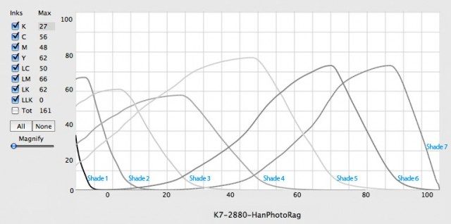
Bookmarks