
Gari, very nice hues and contrast.


Gari, very nice hues and contrast.
Lomdammen in Adventdalen, Svalbard. Time stands still…
Charten 5x7, Goerz Dagor 1:6.8 6½ inch.
Mike,Originally Posted by Mike1234

IMO, most waterfall shots are a dime a dozen and fail to interest me. However your shot here rises way above the mass of 'me to, ho-hum' small waterfall photos.
Very nice!
Don Bryant
Don, you're far too kind. It is a very nice little spot on the trail though. I didn't want the waterfall to dominate the scene but rather simply be a part of it. I tried to find a balance for whatever that's worth.
Well the out of focus rock in the lower corner didn't disturb me, but if I had to pick knits that would be it. The composition, tonality, and detail works, IMO. Also what is important to this shot is what is not included, which in many cases of water shots is the inclusion of irrelevant and distracting sections of bright sky areas. Granted that's hard to do with a lot of scenes of this type but I prefer to crop tightly to strengthen the tonal composition.
Don
Yeah, that rock bothers me too but I couldn't move over enough to eliminate it. It was a conscious choice to allow it to lose focus so I could concentrate on getting the rest of the image right. If I still had the neg I would have a drum scan done and use PS to eliminate it. Speaking of distracting elements, I removed a few sticks and twigs from the water and a couple of branches from the rocky area near the waterfall just before clicking the shutter. I agree that there is always a happy balance between including too much and too little.

Less is more!
"I believe there is nothing more disturbing than a sharp image of a fuzzy concept!" (Ansel Adams)
https://philippe.grunchec-photographe.over-blog.com/

Camera: Sinar Alpina.
Lens: 180mm Caltar II.
Film: Kodak Portra 160 VC
Dear csant,
Nicely done...
The colours are very subdued, and I would kill to skip a stone on that water.
jim k

csant, that photograph is hauntingly beautiful. How big have you printed it?
 Posting Permissions

 Reply With Quote
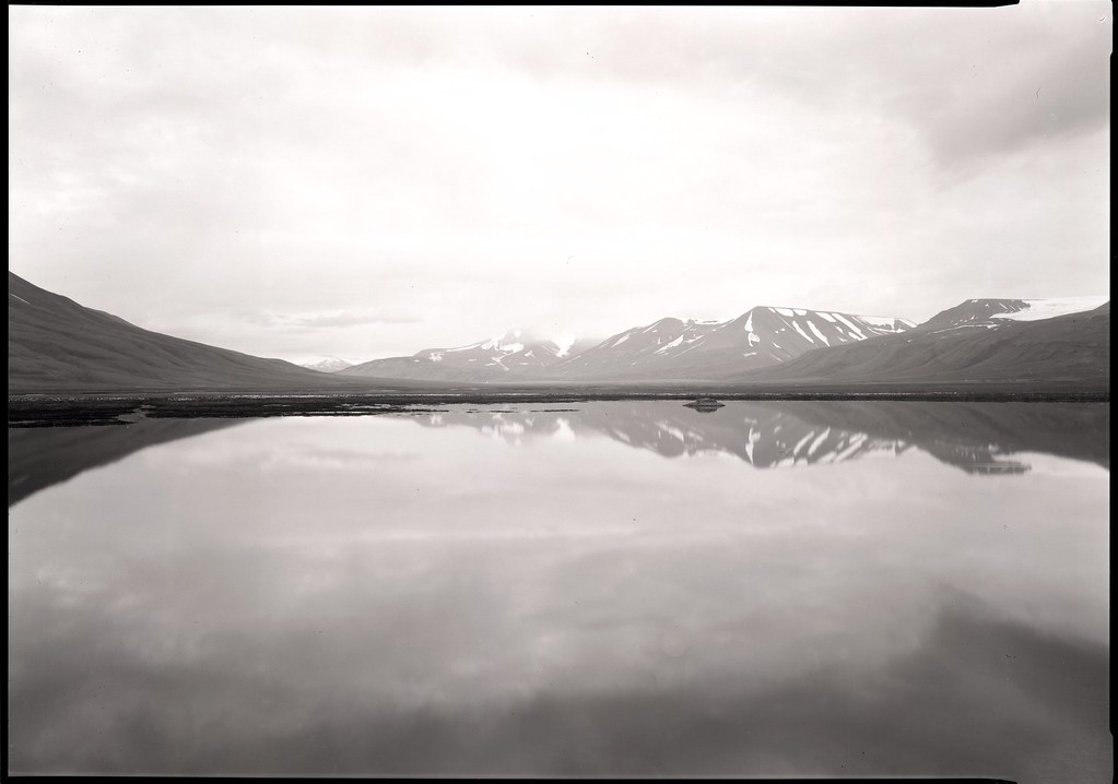

Bookmarks