
#1 is awesome, Robert.


#1 is awesome, Robert.
Lovely, calm sunrise/set, Alex! Great colors. Very nice compositional choices for what could have been a blank open expanse of water.
Thank you!Originally Posted by Michael Roberts

Another landscape and trees./ Toyo 45 CF, 210 and 240 mm lenses, Velvia 100 /.
3 (2).jpg 002 by Alex Menkov, on Flickr
5 by Alex Menkov, on Flickr
Lake Borka with Daune in the background. Northern Sweden.
Chamonix 45H-1 and Symmar S 150/5,6
Kodak Ektar 100 4x5

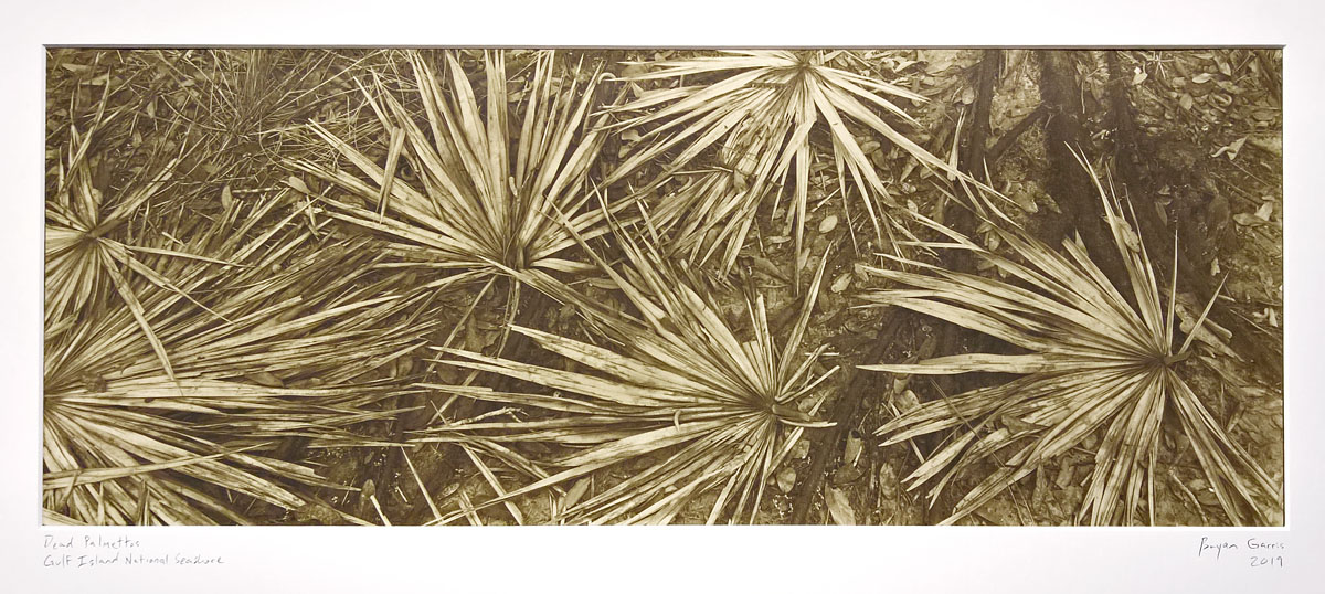
One of my latest prints, an 8x20 contact print on Ilford MGIV matte paper and toned in thiourea, matted to 12x24
Dead Palmettos, Gulf Island National Seashore
8x20 Korona / Deardorff, 305mm f/9 G-Claron, HP5+, HC-110 dil. H


All very nice images It is late and I got work in the morning, good thing though or I would comment on all the images posted as of late.
Definitely a photogenic understory in that part of the world--though I'm still waiting for an Eastern diamondback digesting a pocket gopher...he'd probably hold still enough for the LF treatment.
A question: as my mama said, de gustibus non est disputandum, but I'm curious if you prefer matte to glossy for these sorts of "busy" shots (or perhaps you just got a deal on those big sheets?)
I generally prefer matte (or semi-matte) papers. I just think they have more depth, and sometimes glossy looks chintzy. But on the flip-side, they can be very difficult to print on. Glossy seems more forgiving, especially in the shadows, which on matte needs to look a little thin out of the frame, even dry, to look just right on the wall.
I haven't thought too much about glossy vs. matte for certain subjects, though I could see an argument for, say, water or ice being a bit strange on matte, but everything has a bit of sheen once it's behind glass.
Another thing - my friend/mentor used to wax his matte prints. This is an old-school technique, and it looks amazing, giving the paper more of a semi-matte look. But it takes a looooong time and is quite a lot of work.
Very interesting...thanks for elaborating.I guess it's probably a stretch to say a matte print is analogous to what the carbon print guys produce, but I could imagine a bit of texture couldn't hurt conveying this fractal, high-detail landscape.
 Posting Permissions

 Reply With Quote
Bookmarks