
*Comfortably Numb.. or why a strong poke in the eyes or blasting sound is required to elicit any reaction.
Bernice
Originally Posted by LabRat


*Comfortably Numb.. or why a strong poke in the eyes or blasting sound is required to elicit any reaction.
Bernice

I think we're living in the age of "comfortably dumb"...
"I love my Verito lens, but I always have to sharpen everything in Photoshop..."
Bernice, I remember that Wilder Shore exhibition. They put it in the Science wing rather than Art hall of the museum because it was, as the sign entering the exhibit stated, regarded as more natural history than art photography. Morley wasn't canonized quite yet, and probably never will be in color. Desaturation was an interesting trick, but so what. Oversaturation is another trick, but so what. Intelligent use of color isn't necessarily bound to either. I've certainly gotten "uncomfortably numb" to all those passe tricks over the years. And the speed by which all these new digital tricks arrive make me numb even faster. I have little patience with gimmicks. Morley is best remembered for documenting Victorian SF residences in color, in
the book Painted Ladies. And that was definitely not "desaturated". I did quite a bit of architectural color consultation at the time. Loud loud loud loud was in vogue in house paint; or perhaps psychedelic was the more accurate term. The whole name
of the game was how to use neutrals and complementaries to keep those noisy hues from canceling each other out. Much of
my business came from redoing the color messes others had made. But when it came to Janis' mansion, I stuck to technical
consultation. It was basically a direct restoration of an alternate universe situation, equivalent to walking inside Salvador Dali's brain. ... weird, weird, weird. Dominant colors: pink, purple, black, and gold leaf.
Could an individual be sensitive to the way Nature really is or Creative when an individual is Comfortably Numb?
How does this bias or drive creative work?
Bernice
The director of the Photo wing at that time actually had a very good eye himself. He certainly gave me a nice color gig once. Don't know if he's still alive. Most of that circle was awfully hard drinking. I served only beer here, those times they were over. One of them is now in terrible health due to routinely smearing lead and cadmium pigments with bare fingers. Made him shakey and ornery, neither numb nor dumb. I'm convinced Van Gogh was simply over the top as it was. Nobody can put that much intensity into every brush stroke without being on the edge to begin with. That's why every faker that studied every technique of Van Gogh looks fake - they simply aren't him. But his color theory is known by every serious house painter, obviously not with the same finesse. Most color photographers understand color just about as much as a stewed carrot does.

Try living in a country where the grass literally grows in Krylon fluorescent green shades... Very often needs toned down from 'reality' so that it actually looks 'real'!
Then again, I've seen someone paint a (very much alive) tree in their front garden with green enamel spray paint...
What, more candy colored calendar eye popping stuff?!???
I like color that makes me feel something... Many films of the past could have some good colors, but most were balanced for good rendition for a common consensus of people's taste... One thing I like about digital now is it can surprise me that it can pick up hues that rarely happened on film, like some golds, oranges,blues etc that didn't just pick up the color bias of the film stock used... (I'm thinking of the Tibetan cloth hanging at a friend's place I just shot with my fone, and it captured the hues film couldn't. ..)
But now I primarily shoot B/W, that can have it's own abstract mood
for the viewer to interpret in their own mindscape, and hope they can start imagining and visualizing...
Steve K
All things considered, how could a sensitive, creative individual not be a bit numb by now?
If I spoke for others, that would take the individual and the creativity out of the equation. But me and Tink, we opted for a little numbness...
"I love my Verito lens, but I always have to sharpen everything in Photoshop..."
Leo Kottke once said, at a concert I attended, "you write when you're manic, and edit when you're depressed". Or words to that effect.
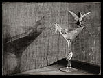
For myself, a drop of something is most welcome when the shoot is finished and the camera is packed away. I don't think that I'm as depressed as Mr. Kottke claims to be, or as tormented as Roger Waters (not to mention Van Gogh) so extreme measures are not required (very often). But now that you mention it, Plymouth martini with a lemon twist please!
I miss View, I was always thrilled when a new issue arrived (regardless of how behind schedule it was)
My back issues are still a valued resource.
 Posting Permissions

 Reply With Quote
Bookmarks