
Ramiro, you can also ask in Manuel Riesgo, in Madrid. I think they have better prices than Dalmau, but with Riesgo you'll have shipping charges (MRW, 9 euros)


Ramiro, you can also ask in Manuel Riesgo, in Madrid. I think they have better prices than Dalmau, but with Riesgo you'll have shipping charges (MRW, 9 euros)
Thank you Pau, I looked at their website and didn't see it. Dalmau is so far from the center though... I live in Sitges
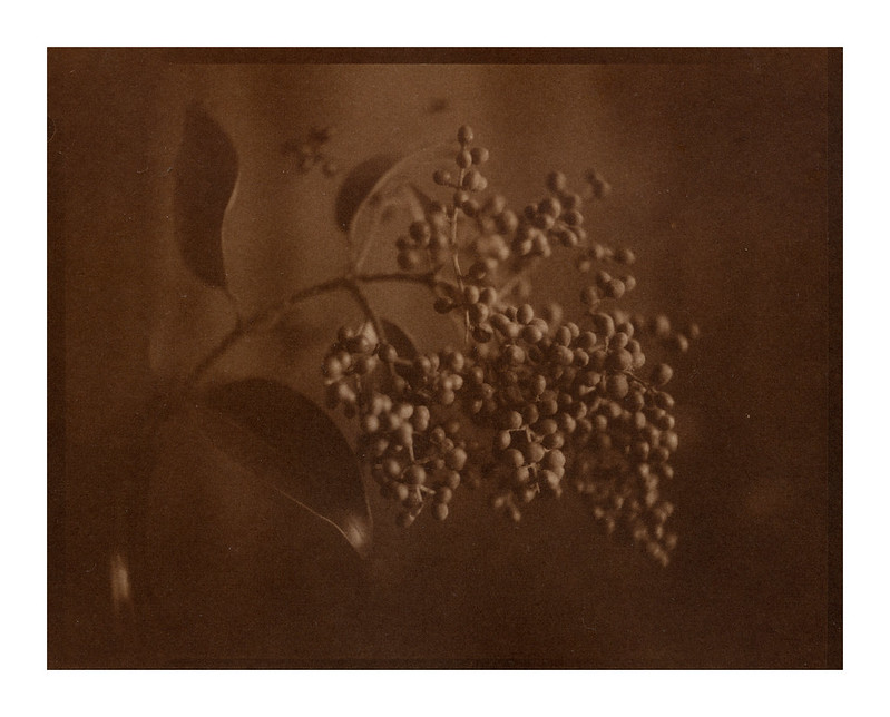
img306 by rabato, on Flickr
I am becoming quite puzzled with this technique. Before I started, and having read a few tutorials and guides, I was expecting brown colored prints. My first three came out with a neutral tone which I very much like.
Using the same paper, sizing and silver nitrate dilution and a few prints after, I haven't been able to reproduce those neutral tones.
I went back and re-checked every step before coming back here. I first thought I had possibly contaminated the silver nitrate solution and made a new batch.
One thing I wasn't doing right was washing the brush after every coating which might have caused irregularities in the coating.
On top of that, I see many salted prints that are neutral colored/toned... so, what is to be expected? what's common?
Domingo, I just saw your reply by chance! Don't know Riesgo, I'll look him up. Dalmau is quite expensive. I actually ordered my stuff form Didactis in france.Originally Posted by Domingo A. Siliceo

This is the albumen version of the previous image. The contrast is much better but I enjoy the salt print much more.
img306 copy by rabato, on Flickr
That's beautiful. I made some the other day too and seem to be getting a brown tone but I think my gold borax toner is exhausted, it was well used anyway and has sat in a bottle for 2 years now, so I might start fresh. It takes a few attempts to get the coating right and exposure ok. I was getting better contrast with sunlight but this was made with a uv lamp because the sun set.
David Cary
www.milfordguide.nz

I made some tests yesterday and found my negatives to be woefully under exposed and under developed. They will print beautifully in silver, will look good in pt/pd also, but salt...no way...my exposures are not even giving me d-max in the border at all. I'm going to run a test and process in 2x strength PMK today and see what it looks like. I am using Fabriano Artistico for my tests and using a gelatin/sodium chloride solution applied with a hake brush. Also using a 12% Silver Nitrate solution, but will also mix up some 20% and try it too.
Salt prints are tricky little beasties.
That's the same chemistry I am using Kimberly. My negatives are all over the density range, I am amazed at how bad I am at developing but I can tell which are going to print out well right away.
I am mainly using two papers, Arches Satine fine grain and Sholler (which I suspect is hard to get outside the EU).
I still find my prints to be too brown. David, your example looks like my first prints.
Here's another print out of a thin negative together with a low contrast set up.
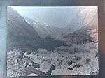
img305 by rabato, on Flickr

Anything over 12% is supposed to reduce the contrast. The standard is 10-12% and I choose 11%. This is what you want to arrive at:
Thomas
Any idea where the brown is coming from then?
Interesting. James' book suggests that 20% is what he has standardized on after trying it for high altitude (I'm at 4600 feet). I figger I won't know until I try it at least... Processing my step wedge to try to determine a good EI and processing time in PMK right now. I shot a step-wedge on 12x20 and will make a salt print from it later either today or tomorrow. Thanks for the input guys.
 Posting Permissions

 Reply With Quote


Bookmarks