Results 1 to 10 of 10

Thread: Help Evaluate First Print

  1. #1

    Join Date
    Jan 2012
    Location
    Boston, MA
    Posts
    84

    Help Evaluate First Print

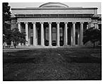
    I've just gotten into 4x5 photography and have been practicing the past few months. I finally think I have a few photos good enough to print. Here are some low res scans. I'd like everyone's opinion about whether or not these are good enough aesthetically. I'm thinking about making a 16x20 print of one of these and it's expensive, so I don't want to waste my money. Which do you like better (I have an opinion, but I'm curious to hear what others think)? Also, let me know if you think any adjustments need to be made. I typically don't like to heavily edit photos in post-production. Thanks!

    Click image for larger version. 

Name:	MIT 1.jpg 
Views:	103 
Size:	52.9 KB 
ID:	101424Click image for larger version. 

Name:	MIT 2.jpg 
Views:	90 
Size:	68.0 KB 
ID:	101425
    Last edited by nimo956; 5-Sep-2013 at 11:35.

  2. #2

    Join Date
    Sep 2012
    Location
    Holland
    Posts
    363

    Re: Help Evaluate First Print

    I have a few thoughts, but in the end it is all about personal taste. You're the one that has to look at the print, so you might as well print it like you want it. A print of that size is a commitment, but I've never regretted printing a photo. If I didn't like it at least I learned a lot from it.

    Technically they both seem fine. Both well exposed and by the looks of it sharp throughout.
    Personally I like the first one better than the second one. The composition in the second one looks a little bit awkard to my eye. The top of the building is cut off with too much empty space on the bottom. It also doesn't feel dynamic enough (for lack of a better description), with the trees at the side.
    With a big print like that flaws will get exaggerated. The first one isn't totally straight, you might need to rotate or correct the perspective a tiny bit (assuming you are not wet printing). You didn't take it exactly square with the building.
    The picture seems to be a tiny bit darker at the top than it is at the bottom. I don't know if that is how it was or that it has to do with movements on the camera or maybe a bad scan.
    I would also alter the contrast a little bit. It looks a little flat, the highlights and midtones could do with a bit more punch and the shadows might look better if they were opened up a little. The top corners are a little dark (edge of the image circle?), but that might be considered character instead of a flaw.

  3. #3

    Join Date
    Jan 2012
    Location
    Boston, MA
    Posts
    84

    Re: Help Evaluate First Print

    Thank you for your comments JeRuFo. For the first picture, you are correct that it isn't quite straight at the bottom, so it will need some correcting. Also, I agree that the bottom is too light. It could use a bit more contrast in the highlights and midtones. Are you bothered at all by the reflection in the center of the windows? Could I have used a polarizing filter to get rid of it? For the second picture, it does bother me that the top of the dome is cut off a bit. Also, I could crop some of the grass off the bottom so that the building is a larger proportion of the length relative to the grass. As it stands right now, it's about 60% building, 40% grass. It's really hard to make a good image that you are perfectly happy with! Perhaps I should go back to the drawing board rather than spend all the money to print and frame one of these images after all.

  4. #4

    Join Date
    Aug 2001
    Location
    SF Bay Area
    Posts
    2,707

    Re: Help Evaluate First Print

    Quote Originally Posted by nimo956 View Post
    Are you bothered at all by the reflection in the center of the windows? Could I have used a polarizing filter to get rid of it?
    To me, the reflection is the heart of the composition. Very good. I would have concentrated on that element of the composition, moved in on the sides, and cropped out the lettering. All of which comes to the point of the photograph --- is the attempt to show the architecture (which you have done well) or to frame a strong, somewhat abstract composition? Two different propositions. Some of the points already made are valid, but I think you are on the right track. Thanks for sharing, and asking.

  5. #5

    Join Date
    Sep 2012
    Location
    Holland
    Posts
    363

    Re: Help Evaluate First Print

    A pola filter would make you able to see through the glass, but I doubt that would make the image look cleaner, because then you would look into the building. I kind of like the reflections.
    I personally wouldn't bother with the second image, the first one is nice, the second one has too many problems.

    A perfect image is probably a lifelong pursuit, but that's the fun of it. Shooting architecture is a very good way to learn though, because it is so technically challenging too.

    If you're not sure, you can always live with your images for a bit. But I wouldn't be held back by the technical imperfections, just see if you like it. The nice thing about having prints is that in a few years time you can see how you've developed as a photographer through the years.

    I made a quick adjustment on the first image to show how I would like to see it. I didn't do a full correction on the perspective, only a slight rotation. Hope you don't mind.

    Click image for larger version. 

Name:	nimo956.jpg 
Views:	33 
Size:	232.1 KB 
ID:	101426

  6. #6
    Jim Jones's Avatar
    Join Date
    Aug 2006
    Location
    Chillicothe Missouri USA
    Posts
    3,076

    Re: Help Evaluate First Print

    While the second photo shows the building in its environment (which is more informative in some venues), the first photo is more pleasing. Merg's suggestion on cropping is valid. However, the lettering provides the answer to the question of where. Some of us are curious about this. Such a diversity of viewpoints keeps photography vital. A polarizer might have little effect in this situation.

  7. #7

    Join Date
    Mar 2002
    Location
    The "Live Free or Die" state
    Posts
    1,004

    Re: Help Evaluate First Print

    I personally like the reflections in the first image. I would crop off the letters since it distracts me that the words are chopped. I think just the columns, steps and windows are a stronger composition.

    It's certainly worth printing, even if you just do it for the experience. With 16x20 I usually try to get the printing down on an 8x10 first, then with careful test strips I can scale the exposure up to 16x20 easily. Saves a lot on money in paper that way.

  8. #8

    Join Date
    Jan 2012
    Location
    Boston, MA
    Posts
    84

    Re: Help Evaluate First Print

    This is a quick crop that shows the building without the letters on top. In the first image, I've increased the contrast a bit. Does this look better? I think the increased contrast gives it a bit more punch, but I don't want to lose too much detail in the pattern in the ceiling or the tops of the windows. The second image is just the crop with no change in contrast. The third is the original image.

    Click image for larger version. 

Name:	MIT 3.jpg 
Views:	15 
Size:	46.6 KB 
ID:	101453Click image for larger version. 

Name:	MIT 4.jpg 
Views:	13 
Size:	45.9 KB 
ID:	101454Click image for larger version. 

Name:	MIT 1.jpg 
Views:	103 
Size:	52.9 KB 
ID:	101424

  9. #9

    Join Date
    Mar 2002
    Location
    The "Live Free or Die" state
    Posts
    1,004

    Re: Help Evaluate First Print

    I like the crop with more contrast. I think I would try to include the bit of trim between where you cropped and the words, but I think it looks good this way as well.

    How are you going to print these?

  10. #10

    Join Date
    Sep 2012
    Location
    Holland
    Posts
    363

    Re: Help Evaluate First Print

    I disliked the words at first, but now that I see it again, I would leave them in. They give the picture something playful besides telling the name, IMO.

Similar Threads

  1. How to evaluate a B&L Portrait Unar
    By C_Remington in forum Lenses & Lens Accessories
    Replies: 6
    Last Post: 23-Apr-2013, 15:34
  2. Shootout...$1.50 Ink Jet Print vs $250 Eastman Kodak Dye Transfer Print
    By slackercruster in forum Darkroom: Film, Processing & Printing
    Replies: 27
    Last Post: 10-Jul-2012, 19:59
  3. how to evaluate a negative without a darkroom?
    By Darin Cozine in forum On Photography
    Replies: 13
    Last Post: 9-Jan-2004, 09:21

Bookmarks

Posting Permissions

  • You may not post new threads
  • You may not post replies
  • You may not post attachments
  • You may not edit your posts
  •