
I enjoyed the sample clip showing him photographing one of my favorite subjects. I think I need to see more; thanks for the link.Originally Posted by Merg Ross


I enjoyed the sample clip showing him photographing one of my favorite subjects. I think I need to see more; thanks for the link.
Georgia O'Keefe, 1923
Alfred Stieglitz
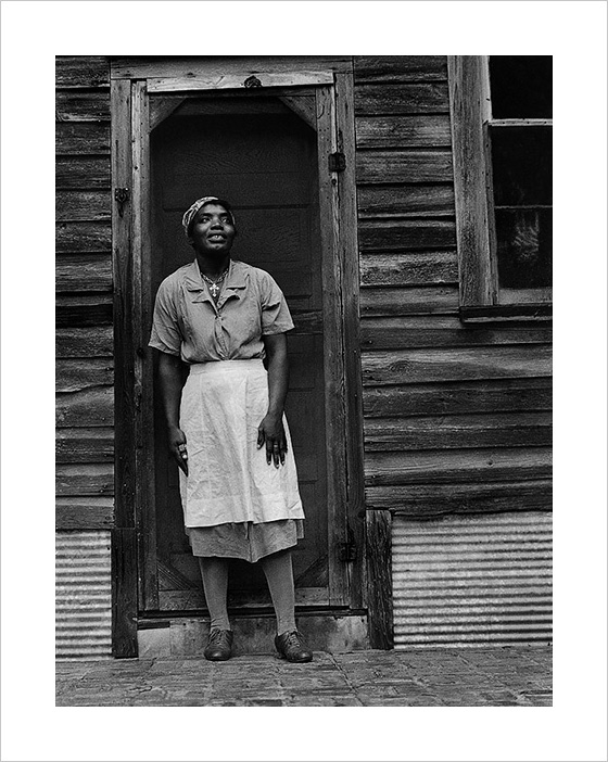
Another example.
Edwards longstanding experience with pyro and his capability to engage its inherent developing energy to separate tonalities is simply legendary. Materials of the day such as thick emulsion films and silver chloride printing papers (capable of fully complimenting a robust full bodied negative) produced prints that pull you in visually and allow Edward the ability to express himself as he intended. The results speak for themselves.
Last edited by Michael Kadillak; 2-May-2019 at 20:21. Reason: typo

Wow. That's a beauty.
Ken Lee said: "It strikes me as harder to make beautiful images in real black and white: a bit like doing a high-wire act without a net".
That's more challenging than playing tennis without a net, for sure!
I think the key is to make a photograph when you feel a kind of love, or gratitude, for the subject. All else follows from that.
Weston's last images that he made in Carmel, which I had the chance to see not so long ago, seem to show this.
Also those of certain other photographers. It doesn't seem to matter all that much what the subject is. We are all a part
of Nature, quite indistinguishable from the rest, from just a little distance away.
I preferred EW's earlier images, and many of his mid-career classics. But some of his later work seemed more neat (orderly) and clinical. I got to see some of his original prints long before I ever saw any of AA's actual prints. But I consider Brett to be a better printer than either of them. I've seen Steiglitz's master print of that O'Keefe image too. Quite a different feel than either of the Weston's work. Can't remember if it was on printing out paper, but something contact-wise fairly warm olive-toned. EW made a lot of so-so prints. A lot of his "reject pile" turned up long afterwards in a particular private gallery collection someone in Carmel had inherited. They didn't sell well. I never keep dud prints unless I want a specific reminder on hand how to reprint it better. Every darkroom needs a serious trashcan.
Brett was a master at printing his own negatives. A better printer than Edward or Ansel? I don't think so, Drew.
I was able to find the DVD Brett Weston Photographer by Art Wright that I acquired years ago. Will enjoy it again along with the archived images. Thankfully someone (ie Art) was able to get Brett to do the video.
I certainly respect your background and opinion, Merg; but I've never considered AA a master printer. And I have good reasons for stating that. He was extremely disciplined at getting what he wanted out of the light; and I should know, having spent my entire life in both the Sierras and here on the coast. So I know better than most what has the "feel" of authenticity, and what does not. But I guess I never cared much for his predictable Dektolish lack of tonal nuance (by tone I am implying "toning", not gray scale control). Brett's prints had something special I could see clear across a room, a kind of glow to them like a daring ice skater right on the edge. I also consider him one of the very few photographers who can be said to have made a true contribution to abstract art per se. No photograph containing actual subject matter can be claimed to be an actual abstraction. But he had a feel for the same kind of visual elements. Most of what people call photographic abstraction nowadays are just predictably decorative pattern studies with no Gestalt to them. I don't try to imitate either of those men, or EW either. Perhaps because I was a color photographer first, I tend to see black and white prints in color too, and am extremely aware of hue nuances in them. It's a big deal to me. And although BW aimed toward very rich neutral blacks, somehow that marriage of Seagull and amidol sang in a manner few other prints achieve. Nowadays it is simpler with the high quality of certain VC papers, but it still takes a special eye to translate that potential into something remarkable.
Thanks Drew. Perhaps I did not express my thought well. I was suggesting that Brett was a master printer of his own negatives, with an intended result. Sure enough, you can pick out his prints from across the room. However, Edward and Ansel were also masters of conveying what they wanted to in their prints. Three masters, three different results. So, you prefer one result to another. However, all three were, in my opinion, master printers. Not really a competition, simply different styles of printing.
As an aside, I was there when Brett was printing Edward's 50th Anniversary Portfolio in Edward's darkroom, and later the Print Project from 800 negatives. It was a very difficult time for both of them because Brett could never make a print the same as Edward's. Over and over, he was sent back to the darkroom to get Edward's approval. The prints were for the most part magnificent, especially those in the 50th Anniversary Portfolio, but they were not Edward's. I think Cole came closer to printing as Edward would have, partly the reason Edward chose him for the task in his Will.
 Posting Permissions

 Reply With Quote
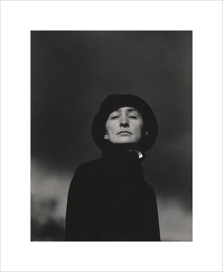
Bookmarks