
The full filter set is not that expensive, so when using VC paper, I'd just get all filters and do a single exposure.


The full filter set is not that expensive, so when using VC paper, I'd just get all filters and do a single exposure.
Split printing using deep green versus deep blue filters allows a greater contrast range. But I can make virtually identical prints using my blue-green V54 cold light, split printing using hard 47 vs 61 glass filters over the lens, using dedicated channels on my additive RGB colorheads, or using M versus Y on my subtractive heads. No need for a filter set when a continuous filter range is right in the head itself. Normally I just use the raw light unmodified. But then going back and punching in a tweak of hard blue or green can solve issues difficult for any intermediate filter alone. Sometimes I deliberately make 8x10 negs so thin that the silver image isn't even visible; but a deep blue filter translates the pyro stain itself into a wonderful full-scale print. At other times, the original neg range is reduced via an unsharp mask, and then all that sandwiched tonality expanded on VC paper using a deep blue filter, resulting in highlight detail and midtone microtonality otherwise unachievable.
+1Originally Posted by cowanw

I find burning with the 00 filter (or the yellow dial all the way maxed) incredibly useful for enlarging. In fact I got so used to having the ability to selectively darken with that lower contrast that the few times I've tried to return to graded paper I'm usually not happy with the prints...I never did get the big advantage of split filter printing other than burning, none of the serious printers who taught me used it with any regularity....only trying it on the occasional difficult negative....
If you are using filters you may find you like certain images using grades 1 and 4 instead of 0 and 5 . And you can do things like start with a 2.5 and do additional burning with higher or lower grades as needed. If you have a head that only uses green/blue lights then you have to get a bit creative with your timer. I am still trying to figure out what to do when a negative has a high contrast vs one that has low contrast (highkey, low key, Middle of the zones) - My first thoughts are usually wrong and I usually end up at a higher grade than when I start. It really takes several images to get a feel for it unless you like printing step wedges.
The magic you are looking for is in the work you are avoiding.
http://www.searing.photography

I often burn in edges and corners, when they are too light, with a grade or so lower than the basic exposure. Done properly, it doesn't over-darken the lower tones but it lowers the high tones to where they need to be.
On negatives that I've printed on lower contrast grades, sometimes the print seems to lack any solid blacks. A brief all over exposure to grade 4-1/2 light often sets the blacks in nicely and makes the whole print much better, affecting the mid-and high values little if at all. Only a short exposure is needed-- if the basic exposure was say 35 seconds at f/11, try 6 seconds at f/16 for the high-contrast exposure.
This also works to emphasize the contrast in e.g. a cloudy sky that shows tone with the basic exposure, but no texture.
I split-contrast print along these lines probably 75% of the time.

I Split-Contrast print with only grades 0 and 5. IMHO, anytime the use of middle grades is used the mid-tones become increasingly contaminated with Green light. Since Mid-Tone contrast is the single most difficult aspect of the Silver print to affect, the less Green or 0 filtration used offers more printing flexibility. This article I wrote maybe of help to those unfamiliar with a deep dive into Multi-Contrast papers. https://unblinkingeye.com/Articles/F.../flashing.html
I also typically just use "full green" and "full blue" (00.0 and 5.0 on the Heiland unit). Then again, there are times when I've split between adjacent values...in this case (see photo - not a great copy, sorry) an equal split between 1.6 and 1.7. Anything else or anything further apart simply did not work.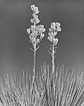
Unless of course, you were to process the film via the Extreme Minimal Agitation technique
Well, there is always masking for those extra special negs. That's one way to have your cake and eat it too. Full tonal expansion with development, then an appropriate mask, then printing high-contrast on VC paper using blue filtration. But it can be overdone if one is not careful.
Whatever your technique, the picture here is lovely.
It's all about the print.
 Posting Permissions

 Reply With Quote
Bookmarks