
David - Thank you very much !
One helpful approach - for this sort of photo especially - is sharpening different areas of the gray scale separately. See this brief explanation.


David - Thank you very much !
One helpful approach - for this sort of photo especially - is sharpening different areas of the gray scale separately. See this brief explanation.
Last edited by Ken Lee; 6-Aug-2018 at 14:19.
Ken, you have such a unique style. Such a simple photo but it's wonderful.
My website Flickr
"There is little or no reality in the blacks, grays and whites of either the informational or expressive black-and-white image" -Ansel Adams
Thank you very much. It's hard to see our own style... if we have oneOriginally Posted by Zaitz

")
Speaking of style, I've long admired the style of this photo by George Tice, entitled "Oak Tree, Holmdel, New Jersey, 1970". It's the first Palladium print I ever saw, and at the time I didn't even know what that meant, but it looked more like a sculpture wrought out of Palladium, than "a picture of something". We can see the same effect in Paul Strand's 1954 portrait of Murdoch McRury, who appears to be made of Bronze.
Last edited by Ken Lee; 6-Aug-2018 at 14:18.
...been a while...
4x5 calumet, 210mm caltar. tmax

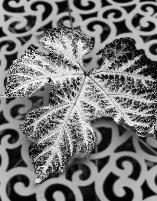
Taken a couple of weeks ago in my garden. It's a bit stark, perhaps that's the point? Comments welcome as it's an image I'm not too sure about ...
Vine Leaf
Simply Beautiful
I love the idea - the strong tonal contrast allied to the shape contrast between jagged edges and smooth curves.
It doesn't quite work for me for two reasons. First, the tabletop recedes, and looks like a three-dimensional planar object, while the leaf is a planar object that seems to be straightforwardly perpendicular to the lens axis. That could be used to set up a tension between the two mutually inclined planes, but in this case it feels awkward.
Second, the table seems to be receding from bottom right to top left. The geometric reduction of the size of the curlicues, and the way their edges become more evident all seem to proceed more to the top left than to the top right. That too is unsettling in a wonky sort of way. I've created similar effects photographing sand ripples on a beach with a combination of rise, shift, tilt and swing. Move the lens axis too far off the centre of the image and your brain starts to see a lurch sideways in the resulting image.
Too much, I'm sure. Motivated by the fantastic feel of the basic idea.
"Comments welcome"
Perhaps there is just too much of both elements, with an emphasis on neither. This version, while not entirely true to your original seeing, places one above the other, so to speak.
My guess is that in color, the leaf appeared more separate from the background: the background was more of a background, and the leaf was more obviously the subject. In B&W, they merge a bit - so perhaps it's helpful if introduce some difference of our own.
Last edited by Ken Lee; 6-Aug-2018 at 14:18.
Struan,
Thanks for your perceptive comments. They helped me understand the image better and my discomfort with it. My reworked version (below) in part addresses your observations by reducing the table's size by trimming to a square. It keeps all of the contrasting shapes but without the dominance and effect of the slope being so obvious. Also, with the leaf being larger its plane dominates the table's plane.
Ken,
Completely agree and have reworked to subdue the white table - but I decided against softening it as you've done. And, as I like square format images, this format helps to reduce the impact of the table. And I allowed more room around the leaf than in your version. I've also slightly modified the contrast in three areas of the leaf to give (to my eyes) a more balanced image.
I found the leaf sitting on the table but not quite placed as in the image. Initially it was the colour contrasts that caught my eye - the leaf was almost fluorescent red, yellow, orange, green. I don't do LF colour, perhaps I should! But I thought it would work in b&w just as well.
I'm much happier with this version where the leaf is more prominent and the curly table supports rather than being equal ...
Vine Leaf - v2
That is beautiful and one of the reasons I am trying palladium printing. That look is incredible. One guys work really pushed me into it. I'm not sure if it is originally LF but the work is beyond fantastic I think, hope this is ok to post:
http://www.flickr.com/photos/igorsv/3979255097/
Igor Svibilsky
My website Flickr
"There is little or no reality in the blacks, grays and whites of either the informational or expressive black-and-white image" -Ansel Adams
 Posting Permissions

 Reply With Quote
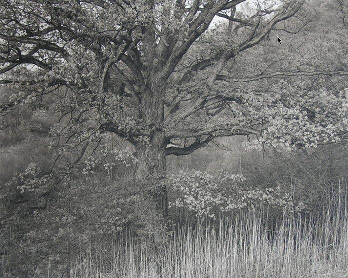


Bookmarks