
I never treat mine with peroxide, but I haven't noticed any lightening of the image upon drying. Unless I use a very acidic first wash and don't wash that all out in subsequent washes.


I never treat mine with peroxide, but I haven't noticed any lightening of the image upon drying. Unless I use a very acidic first wash and don't wash that all out in subsequent washes.
Ramiro,
Gvarro has some creamy-coloured paper that gives lovely results with cyanotypes -I'm afraid I can't find my reference though.
Here's a few I made this week. I decided to document the ugliness of my city. Lots of stuff to shoot. I'm using green-sensitive x-ray film for this, cut down to 4x5. New Cyanotype with a drop of 2% dichromate per ml added for contrast. Can't get the highlights to clear perfectly, but it's close. A lot of the original image is lost in the crappy scans (texture, hue; all lacking or wrong in the digital versions!)
Prints are straight from the original negatives on A5 (roughly 5x7") paper. It's the Dutch Schut drawing paper that I use for nearly all of my alt printing.

I ran a few test with different papers just now. I got quite acceptable results with all of them.
First was Buxton Platinotype which I had to mail order. Expensive stuff (very). Results as expected. Nice tonal range, clear enough highlights.
Second, some watercolor paper I bought from a friend who buys large stocks. This one didn't give me much confidence but it turned out to be good enough. Too bad is very thick and grainy. It reminds me of Gvarro which didn't work for me last time I tried. Mine was bright white Miguel.
Finally, I gave Canson Montval another try. It gives very nice definition and shadows. Too bad the highlights are always tinted in a magenta/brown shade. I've seen many people get awesome results with New Cyanotype and Montval, not my experience though.
All of them were rinsed in water. When using Mike Ware's formula I stay away from citric or acetic acid developing. They just lower the contrast too much for my taste (or my negatives). I should probably try adding dichromate to the sensitizer next time.
I'll post the pics when they dry.
Lower contrast with an acid wash? I haven't experienced this - on the contrary. I find it gives a slight boost to the shadows but mostly washes out the highlights, which I use to get as close as I can get to a full tonal range. The tap water here has quite a bit of calcium in it though, and the paper I use also seems to have a heavy chalk binder, so a slight (say 0.03% w/v) acidification of the first wash bath works well for me. I tried washing with straight tap water the other day, but got very muddy highlights.
Careful with the dichromate. The most I add is 2 drops of 2% per ml; at that point, the contrast goes through the roof (suiting even my weakest negatives) and exposure times are annoyingly long. With a normal x-ray negative and 1 drop of 2% dichromate I expose for ca. 3 minutes; add another drop and it becomes around 6.
Well, at least that's what I use to get lower contrast with the old cyanotype formula... maybe Mike Ware's works differently.
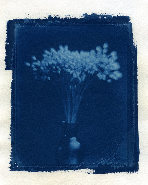
Here's the tests mentioned before:
Montval 01 (Nice density but brownish highlights.)
by Ramiro Elena, on Flickr
Acuarela 300gr 01(Density here is much poorer)
Buxton 01 (coating issues and too much exposure, nice density nevertheless) by Ramiro Elena, on Flickr

Love the prints guys, I am enjoying the classic formula to much to move on just yet...
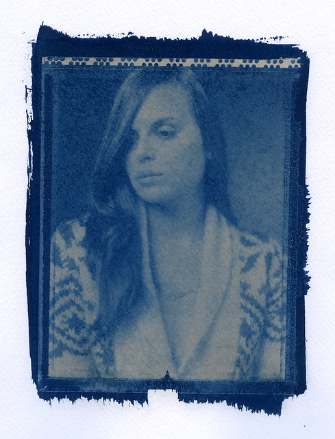
8X10 X-ray neg, Konica Hexanon GRII 150mm

Classic formula is nice too, just different. I tried the new formula simply for shorter exposure times.
With the classic formula I also used an acidic first wash to clear the highlights, but it does seem the new formula responds even stronger to it. Like it responds stronger to any variable you alter! Ramiro, that's a very useful paper test, thanks for posting!
And Randy, that's a fine image from the classic formula coined with a silver negative! I only get such results with digital negatives as my silver negatives always end up too contrasty for the classic formula.
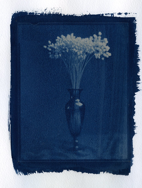
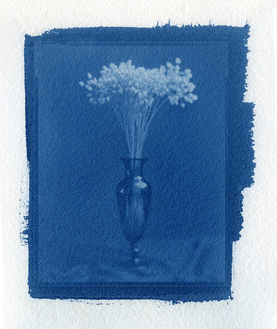
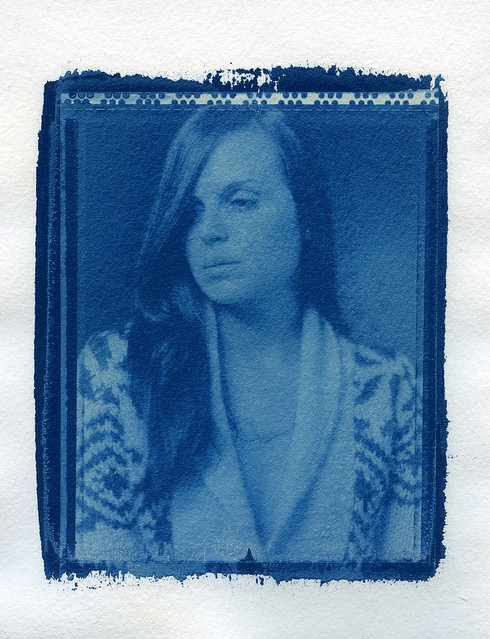
One more paper comparison. Canson Montval versus Buxton Platinotype.
I enjoy the tones in the Montval version, deeper and cooler. The highlights though... I should get clearer highlights with a citric acid wash then Koraks?
Or is it maybe that I need shorter exposure to save the highlights with Buxton Platinotype?
Montval 02 by Ramiro Elena, on Flickr
Buxton 02 by Ramiro Elena, on Flickr
 Posting Permissions

 Reply With Quote


Bookmarks