


Another very useful comparison; keep it up!
I can't claim to be an expert on this process; I've made a couple of hundred prints using both the old and the new formula, but frankly, there are so many variables involved (some of which are unknown and hard to control, such as paper sizing and binder chemistry) that I really can't deal in absolutes...The best I can do is share my observations with it being clear that they are also my interpretation of what's going on. YMMV and I gladly stand corrected.
Concerning the highlights, I have found a few things so far. The new formula especially tends to leave a greenish/grey residue that is visible in the highlights. I suspect this is due to the chalk binder/coating that is present in most papers. My speculation is that this creates a local alkaline environment in which non-dissolvable calcium-iron complexes form and settle in the paper. I try to prevent this in three ways: (1) paper choice, (2) addition of a drop of 40% citric acid per ml to the sensitizer solution and (3) a very slightly acidic first wash.
For the first wash, I usually mix 1.5 liters of tap water with about a teaspoon of citric acid (around 3g in weight), and I further dilute this down to 5-20% with tap water. As you can tell, this is every so slightly acidified. I have tried washing with up to a 10% citric acid solution, which I found leaves the shadows intact pretty much, but washes out the highlights. On the plus side, the highlights do clear to pure paper white this way (but at the cost of massive amounts of highlight detail)!
If I look at your most recent paper test, I would certainly give the first one (Montval 02) another try with an acidified sensitizer and first wash and try different dilutions of citric acid (see above). However, I would count on it that it's only possible to get the highlights to clear with a very strong acidic first wash and that will deteriorate highlight detail. Given the nice dmax of the paper I would give it a try though; it would be nice to combine the dmax of that paper with clear highlights. Btw, the good dmax suggests this paper isn't as alkaline as some of the ones I've tried. I have tried Canson drawing paper (I think 90g/sqm), which works fine with classic cyanotype, but produces a very weak image with the new formula.
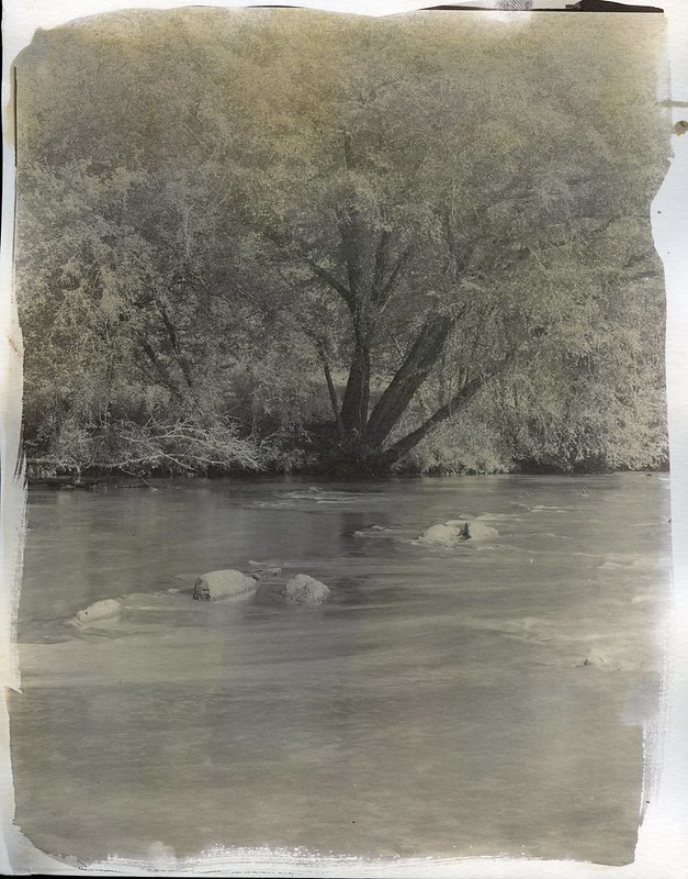
The second paper (Buxton 02) looks much better and you may not even need the acidified first wash, or (depending on the quality of your tap water) only a minute amount of citric acid. I cannot judge it very well in the digital scans, but based on them I'd say the dmax is quite fine as well. This paper may need much less tweaking in your processing to get good results from.
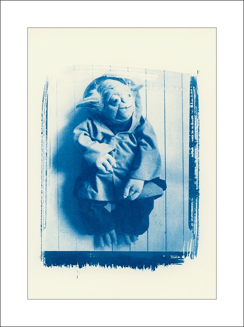
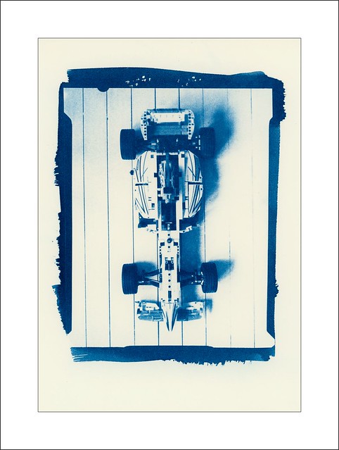
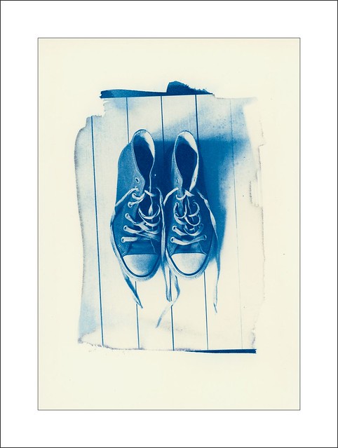
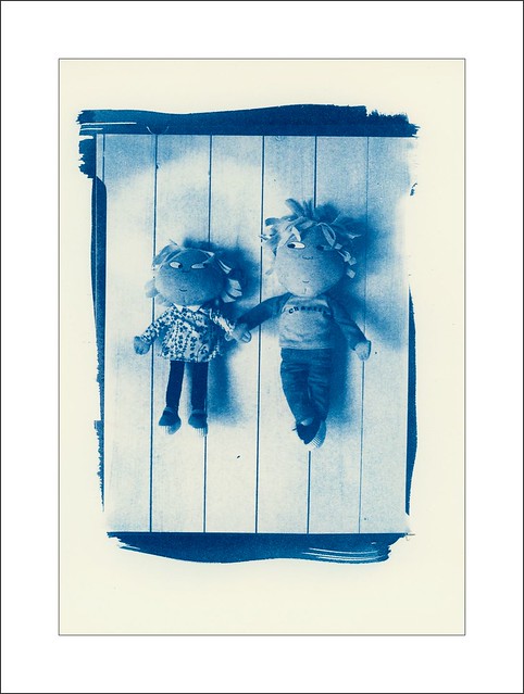
The method I didn't mention to clear the highlights is to reduce exposure. Obviously though, this is a good method, but in the above I assumed that your exposure and the contrast of the sensitizer are dialed in to the requirements of the negative. If you find you get neutrally (blue, not greenish grey) colored highlights and good, dense shadows, then contrast control is the issue. This seems to be the case with the Buxton 02 test image. In your place, I would add a little (more) dichromate to the sensitizer and see if you can get a good print that way. Btw, the same is true for the other test images you posted; I'd try increasing the dichromate concentration a bit to get the contrast right.
However, having said that, like often in alternative printing (in my limited experience), there are interactions that complicate matters. You could increase the contrast of the sensitizer, getting your highlights closer to pure white, but if you also increase the acidity/lower the pH of your first wash, you'll start to degrade the highlights at the same time, increasing the apparent contrast of the print. The trick is to find an optimal combination of sensitizer contrast and first wash acidity, so that you preserve highlight detail and perhaps overexpose the print just a tad, so that you can wash out the unwanted greenish grey stuff with the acidic first wash. Essentially, you'd sacrifice a little bit of the highlight detail to achieve a better chemical purity. This, again, is a bit speculative, so take this with a grain of salt. But it's the hypothesis I have arrived at at this point.
Well, that's a lot of words about the alternative process that is supposed to be the easiest and the simplest to master. While cyanotype is certainly a cost-effective process that yields a somewhat decent result with relatively little effort, I have found it is as challenging as the other processes I've tried to get a print just right. In the dozens to hundreds of new formula cyanotype prints I've made so far, I have maybe 5 that I would consider really good, with even coating, good dmax and highlights that gradually fade into (nearly) pure paper white. The highlights remain a huge challenge; there always seems to be a slightly light grey tinge to the non-exposed areas of my prints that is not quite white, and to get to shift those areas to white, has so far always come at the cost of highlight detail. Maybe my sensitizer isn't as pure as I'd want it to be; I'll mix a new batch in the following weeks to see if it'll do better.

 Reply With Quote


Bookmarks