
Very nice indeed.Originally Posted by jesse


Very nice indeed.
I like this one, has a very smooth and silky look to it.
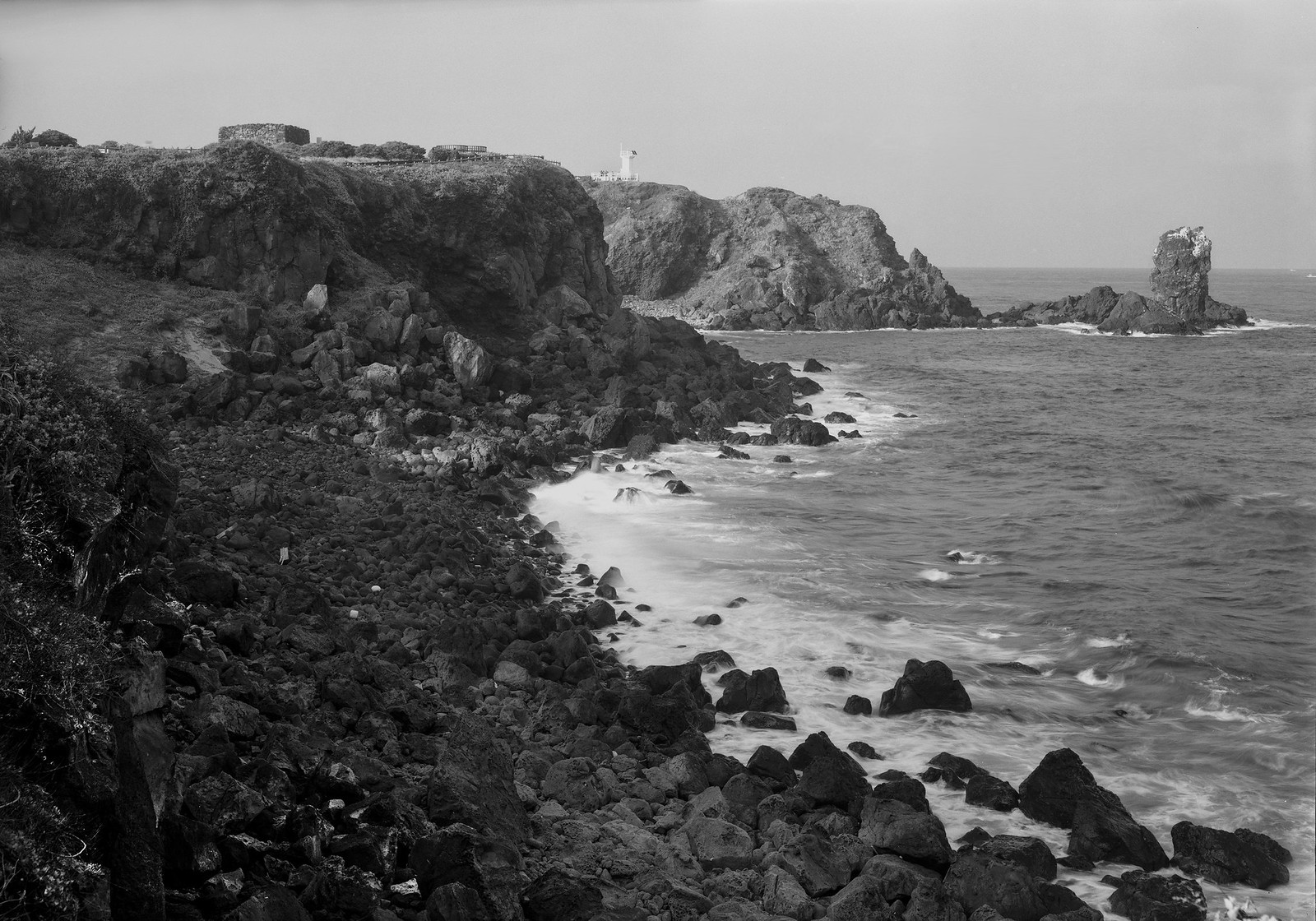
Grand Canyon Toroweep area looking south about 300 yards west of Toroweep Overlook. Chamonix 45HS-1, 90mm Schneider f/5.6@f/32, 3 seconds. Tmax 100, 2-bath Pyrocat. I need to work the sky, it is too flat I think, needs more contrast. It is there, I just need to bring it out.
[IMG]201800901_0115_20181013_Working by Steven Ruttenberg, on Flickr[/IMG]
A fine image Ken!

Steven, nicely done. I like your viewpoint compared to the typical Overlook pictures I've seen. The sky is okay but a little more contrast would match the high contrast of the cliffs.
Thank you. I agree. I am gonna work on this some more and look at one of my other images of this scene as well. I could have use a red filter and even a grad nd to help with sky, but image is almost there.
A sort of comparison between Fuji Velvia 50 and Kodak Portra 160. The film are essentially the opposite, the first is a high contrast transparency film with 5 stops of dynamic range, while the second is a color negative film with an insanely large latitute---everything slooowly fades to white.
It is a sort of comparison because the two images were taken a few minutes apart and the light was very different: too much contrast for Velvia with the sun out. Both images were taken with a 3-stop soft edge graduated filter to control the sky.
Which one do you like most?
I prefer the velvia image. I find velvia to be very true to life when carefully exposed on low contrast scenes.
The two images were taken at Cape Cod; I think they captured many aspects of the northern part of the cape: the big dunes, the particular shrubby vegetation, the barely traveled sand roads, and the amazing light. However, I am not convinced by any of the two shots and I find them too much chaotic for my liking. Still, it was a fun morning and I think the images are worth sharing.
(Velvia on top, Portra below)
If you like more information I took an on-location video when taking those images (link below).
My Youtube Channel - Darkroom and large format tutorials

marcookie, interesting comparison, thanks for posting. The difference in dynamic range seems apparent from the examples. What scanning hardware was used?
Wow!!
Ibthink I prefer the bottom on from Portra.
 Posting Permissions

 Reply With Quote


Bookmarks