
I seem to like HP5 more and more as the format gets larger. I'm not a fan in 35mm. The reciprocity-induced contrast boost seems to help.Originally Posted by jmdavis


Bryan thats wonderful.
I like that the clarity of the water offers a glimpse of rocks below, the complimentary diagonals in upper and lower right...coinciding to add a bit of directional emphasis for the waters flow. That bolt of water in the upper left-middle...could be bothersome if it were broader/brighter, but just right as is, and the "creamy brilliance" of water over rock, a perfect example of allowing bits of scale to migrate up into the "high eights" (assuming that my screen is translating this)...just enough to be maximally effective, without going too far.
Also the format itself...is so very appropriate to capture the broad sweep of a river, and just shy (for me at least) of going overboard, as can anything truly 2:1 (like 12x24) or broader (again, for my eyes). Perfect!
The only thing my eyes are still reaching for is to see just a very tiny bit more into some darks/shadows - but my guess is that your print will show just this much. Its been my experience, at least with work that I've posted which is similar (in terms of subject matter and tonal scale) to your example here, that darks/shadows which I've rendered very dark, and yet with some detail, tend to go quite black on my screen, to the extent that the very minimal (but important) amount of detail there is lost.
Thank you very much John. I am glad you saw the leading diagonal branches, which is really what drove me to make this image as it felt "complete."
Agree on the screen. I think also the size you see on the screen, being much smaller than real life, affects the subjective shadow rendering.

That's lovely Karl! I only just today saw this thread. Very happy to see the interest in this format!
Thanks. It's currently my primary format. Just starting to play around with the 22.25" Verito on 12x20 as well.
A glorious image, one for the ages... great work, Karl!
https://1.bp.blogspot.com/-3DuNeZsbi...A5B6FBE65.jpeg
Folmer-Schwing 12x20
Ilford Ortho Plus 80, 12x20
Nikkor-M 450/F9

Like, David!
Thanks, Randy!
12X20" negative that I exposed at the Great Sand Dunes in 2002. 350 G-Claron at f/32. TMax-400 in Pyrocat_HD.
Sandy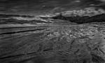
For discussion and information about carbon transfer please visit the carbon group at groups.io
[url]https://groups.io/g/carbon
 Posting Permissions

 Reply With Quote
Bookmarks