Page 4 of 10 FirstFirst ... 23456 ... LastLast
Results 31 to 40 of 93

Thread: Proof to Print: the contrast difference

  1. #31
    Drew Wiley
    Join Date
    Sep 2008
    Location
    SF Bay area, CA
    Posts
    18,397

    Re: Proof to Print: the contrast difference

    Keith, maybe somebody taught that rote grade shift size, but it's largely nonsense. Even before VC papers were improved, I did just about everything, every size, on Gr 3 papers. Any paper of real quality allowed a degree of contrast control simply through shorter and longer development. But I'm speaking in principle; going into detail would have to be product-specific. Going from a tiny print to mural size would obviously involve a modification of strategy. But otherwise, I consider it an old wives tale.

  2. #32

    Join Date
    Jul 2008
    Posts
    3,901

    Re: Proof to Print: the contrast difference

    Most GOOD silver gelatin black & white papers are grade 3 or grade 2. Once past these paper grades, good print making difficulties will occur.

    There is some ability to do contrast control during paper development, but most of contrast control comes from making a GOOD negative. IMO, the best way to achieve fine contrast control is contrast masking. Decades ago friend owned one of the BIG photo print labs in San Francisco. He got a contract to do poster size reproductions of Ansel Adams exhibit PR prints using AA original prints. His solution to achieving a reasonable large prints for publicity display was to use contrast masking to control print contrast. Worked out good. There was a time when SF bus stop shelters had ad prints in them, this is one of the labs that did a lot of those ad prints decades ago.

    And no, these prints would have never been as good if they were contrast flattened.

    Bernice

  3. #33
    Vaughn's Avatar
    Join Date
    Jan 2007
    Location
    Humboldt County, CA
    Posts
    9,223

    Re: Proof to Print: the contrast difference

    Vaughn: I do believe that each print size has its own requirements to be successful. And 8x10 and a 16x20 print of the same image might easily require a different 'look' to be successful. They work differently -- viewing distance, attention to print detail, etc. The 8x10 might have areas of pure black shadows that work wonderfully when those areas are small, all of a sudden become objectionable when enlarged 4 times in area in the 16x20.
    Pere: This is a interesting point I was not much aware.
    Thank you for putting up with my typos! I've been having fun making platinum prints directly from negatives on 120 film (various formats, but usually 2 1/4 sq). Those images work very differently than larger images and I must compose the small images very differently than my LF images. Due to the small size, I found that form becomes far more important than detail. There is little room for the eye to travel around inside the little square -- to bring the viewer into the image. So other means must be used to keep the viewer's attention (subject, form, emotion, etc). It has been quite educational and has strengthen my larger work.
    "Landscapes exist in the material world yet soar in the realms of the spirit..." Tsung Ping, 5th Century China

  4. #34
    Drew Wiley
    Join Date
    Sep 2008
    Location
    SF Bay area, CA
    Posts
    18,397

    Re: Proof to Print: the contrast difference

    I have one of those little 2-1/4 carbon contact print Vaughn made, and its small size does not at all detract from its intricate beauty. In fact, it kinda draws you in, in a way a bigger print wouldn't.

  5. #35
    Vaughn's Avatar
    Join Date
    Jan 2007
    Location
    Humboldt County, CA
    Posts
    9,223

    Re: Proof to Print: the contrast difference

    Thanks, Drew.
    "Landscapes exist in the material world yet soar in the realms of the spirit..." Tsung Ping, 5th Century China

  6. #36
    Drew Wiley
    Join Date
    Sep 2008
    Location
    SF Bay area, CA
    Posts
    18,397

    Re: Proof to Print: the contrast difference

    Bernice, Ansel never seemed to get a handle on masking, so it's interesting that the SF lab which printed some of his negatives used it. It was already routine in color printing, and it's for sake of color work that I got proficient at it, then merely transposed those skills to part of my black and white tool kit. It's those very contracted-out images, the most complete collection of AA's murals ever assembled up to that point at least, that I shared a public exhibition with right after his death, so got to examine them quite well. It is my understanding that he was on hand to at least supervise the printing, even though technicians handled the rest. The feel of those images in big size is quite different from say, 8x10 neg up to 20X24 print. They're a lot softer and more poetic, and just wouldn't hold up well at higher contrast and his usual colder tones because the original negs are pretty grainy and not all that sharp by modern standards at least. But I was strictly color printing at that point in time, highly detailed Ciba prints, and it made an interesting complement.

  7. #37

    Join Date
    Jul 2016
    Posts
    4,566

    Re: Proof to Print: the contrast difference

    Quote Originally Posted by Drew Wiley View Post
    original negs are pretty grainy and not all that sharp by modern standards at least.
    Drew, that SF lab could do something wrong... Probably 8x10² AA negatives can be insanely enlarged with perfect quality. How big were those prints in meters?
    Last edited by Pere Casals; 30-Jun-2019 at 03:28.

  8. #38

    Join Date
    Jun 2015
    Location
    Glasgow
    Posts
    1,022

    Re: Proof to Print: the contrast difference

    Quote Originally Posted by Pere Casals View Post
    Drew, that SF lab could do something wrong... Probably 8x10² AA negatives can be insanely enlarged with perfect quality. How big were those prints in meters?
    No, it sounds pretty much correct for negatives of that period. Before the advent of significantly more advanced controlled crystal growth techniques in the 1950's (graded iodide with high monodispersity) & commensurate sensitising methods & use of acutance dyes, together with the advent of thinner multilayer constructions, most films of reasonable speed were nowhere near as crisp & sharp as we might assume today. Polydispersity gave reasonable latitude at the cost of various other problems & the move to monodispersity at the time was seen as a major improvement.

  9. #39

    Join Date
    Jul 2008
    Posts
    3,901

    Re: Proof to Print: the contrast difference

    All the folks whom worked with AA spoken to told that AA never did contrast masking. There are no examples of contrast masked prints made by AA that I'm aware of. In the case of this particular story, "TH" was a very, very, very GOOD color printer he made prints in every available color technology available back then including dye transfer. This is where his excellent skills at contrast masking came from. Came time to do this project for one of the major SF museums, he simply applied his skills at contrast masking to make the needed prints. This was the color lab in SF that had the Durst 184 head installed into converted elevator shaft to make GIANT prints.

    Worked out really, really well. The effort was to replicate what the original AA prints would be except in a MUCH larger size. AA was long gone when this project was in process.

    One thing I've come to understand from doing many many prints, it is a speciality skill that is difficult to learn by theory alone as the theory is the basic beginning of how to make a print, but can NEVER produce an emotionally expressive print by theory alone. That demands a LOT more from the print maker than theoretical knowledge.


    Bernice


    Quote Originally Posted by Drew Wiley View Post
    Bernice, Ansel never seemed to get a handle on masking, so it's interesting that the SF lab which printed some of his negatives used it. It was already routine in color printing, and it's for sake of color work that I got proficient at it, then merely transposed those skills to part of my black and white tool kit. It's those very contracted-out images, the most complete collection of AA's murals ever assembled up to that point at least, that I shared a public exhibition with right after his death, so got to examine them quite well. It is my understanding that he was on hand to at least supervise the printing, even though technicians handled the rest. The feel of those images in big size is quite different from say, 8x10 neg up to 20X24 print. They're a lot softer and more poetic, and just wouldn't hold up well at higher contrast and his usual colder tones because the original negs are pretty grainy and not all that sharp by modern standards at least. But I was strictly color printing at that point in time, highly detailed Ciba prints, and it made an interesting complement.

  10. #40

    Join Date
    Jul 2016
    Posts
    4,566

    Re: Proof to Print: the contrast difference

    Quote Originally Posted by interneg View Post
    No, it sounds pretty much correct for negatives of that period. Before the advent of significantly more advanced controlled crystal growth techniques in the 1950's (graded iodide with high monodispersity) & commensurate sensitising methods & use of acutance dyes, together with the advent of thinner multilayer constructions, most films of reasonable speed were nowhere near as crisp & sharp as we might assume today. Polydispersity gave reasonable latitude at the cost of various other problems & the move to monodispersity at the time was seen as a major improvement.
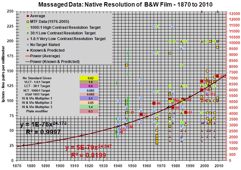
    Interneg, probably you are not much aware of historic evolution of film resolving power, 1940 Kodak Super-XX was resolving 45 lp/mm at 1:30 contrast, what would be around 2286ppi, so a drum scan at 2000dpi of a 8x10" negative would not take all information there.


    http://videopreservation.conservatio...olution_v9.pdf
    http://hubicka.blogspot.com/2016/03/...graphs-in.html

    For the record:
    https://web.archive.org/web/20181008...olution_v9.pdf
    https://web.archive.org/web/20181224...graphs-in.html


    There is some debate about the exact numbers, but a negative of the 1940's has to deliver a 1.5m print that would be perfectly sharp at reading distance, and possibly it would be perfect by 2m.


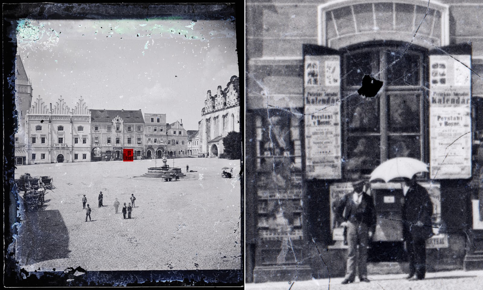
    Here you have a 1885 shot, the crop is 4.5x5.5mm on the glass plate:


    By 1885 5x7" format was outersolving what today can do a $48k Hasselblad H6D-400c, Phase One IQ3, etc...

    I'd say that AA's 8x10" negatives are not a joke !

    In any case, a 1940 8x10" negative is to outresolve the best 4x5" you can make today.

Similar Threads

  1. slim boxes for print proof storage
    By Terence Falk in forum Darkroom: Film, Processing & Printing
    Replies: 6
    Last Post: 7-Aug-2018, 10:00
  2. Determining Final Print Contrast?
    By tgtaylor in forum Darkroom: Film, Processing & Printing
    Replies: 9
    Last Post: 13-May-2013, 07:37
  3. Difference between Kodak print film and movie stock
    By harrykauf in forum Darkroom: Film, Processing & Printing
    Replies: 12
    Last Post: 25-Sep-2007, 17:12
  4. Is B&W Print Contrast Affected By....
    By Andre Noble in forum Darkroom: Film, Processing & Printing
    Replies: 10
    Last Post: 12-Oct-2001, 01:58
  5. difference using dichroic vs variable contrast light head?
    By Yong-ran Zhu in forum Darkroom: Film, Processing & Printing
    Replies: 5
    Last Post: 16-Jul-1999, 16:11

Bookmarks

Posting Permissions

  • You may not post new threads
  • You may not post replies
  • You may not post attachments
  • You may not edit your posts
  •