
I just down loaded the latest image we have been discussing and it is 12mb. Not very large by today's standard.


I just down loaded the latest image we have been discussing and it is 12mb. Not very large by today's standard.
Steven,Originally Posted by Steven Ruttenberg

Is there a reason you upload such large images? 12mb on a website is huge. You could probably save it at about 100kb and look pretty much exactly the same... and in the end you will save yourself the aggravation of having some-bot harvest your image/s and sell them on "ali baba" "Linens and Things" "TJMAXX" or the "Christmas Tree Shop" for $2/30x40 sized posters (that includes the 50% tarrif). On a 30" cinema screen or a cellphone alike 12mb is kind of overkill...
YMMVFTSOTWATUCD
John
Steven
This is a really nice photo! The lack of contrast doesn't do anything to draw the eye into the center, where there is the most interest so I thought I'd try my hand rendering it. I cropped a little bit off the left side and a bit off the top, as well as increased the contrast.

Bernice

Best
Tin Can
I recommend you view paintings from the Hudson River Valley School. Here's a nice one by Samuel Coleman, painted 1866.
Those works are from the Romantic Era (not today's carnival freak-show era) so they may strike the modern eye as overly sentimental, but we can learn a lot from how they treated the landscape when Beauty and Awe were the goals. With that we're back to Vangelis, another Romantic composer, born but just a bit late.

I am not 100% on all this digital stuff. I dragged your image onto my desktop, then into PhotoShop...and the very bottom left corner of my screen read, "Doc: 82.8M/82.8M". I have always assumed that was the file size.
Some interesting renditions of your image have been offered. Some I would consider over-dramatic and change the character of the light, some seem to have changed the sense of the place by removing the foreground. All very subjective on my part, of course, and I am not saying my version is close to the correct one..because there is no correct one other than yours.
The same happened to me with my very first post on this forum. It was interesting to see the variations in cropping...I felt none were 'better' than my original seeing, but it was informative on how others see the world and make images. For some reason images from 2007 are no longer available, tho I found that old thread!
"Landscapes exist in the material world yet soar in the realms of the spirit..." Tsung Ping, 5th Century China
wow, that's something else!


Another thought: Darker rendering can look great on the monitor with very bright border, but prints in typical home lighting may have a much different feel. Maybe edit 3-4 versions, darker and more dramatic to brighter and softer contrast, and pin them up for a little while.

You often feel tired, not because you've done too much, but because you've done too little of what sparks a light in you.
― Alexander Den Heijer, Nothing You Don't Already Know
 Posting Permissions

 Reply With Quote
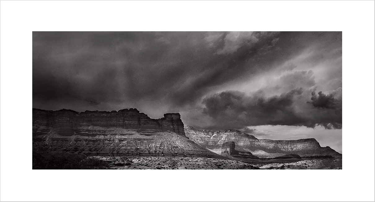

Bookmarks