


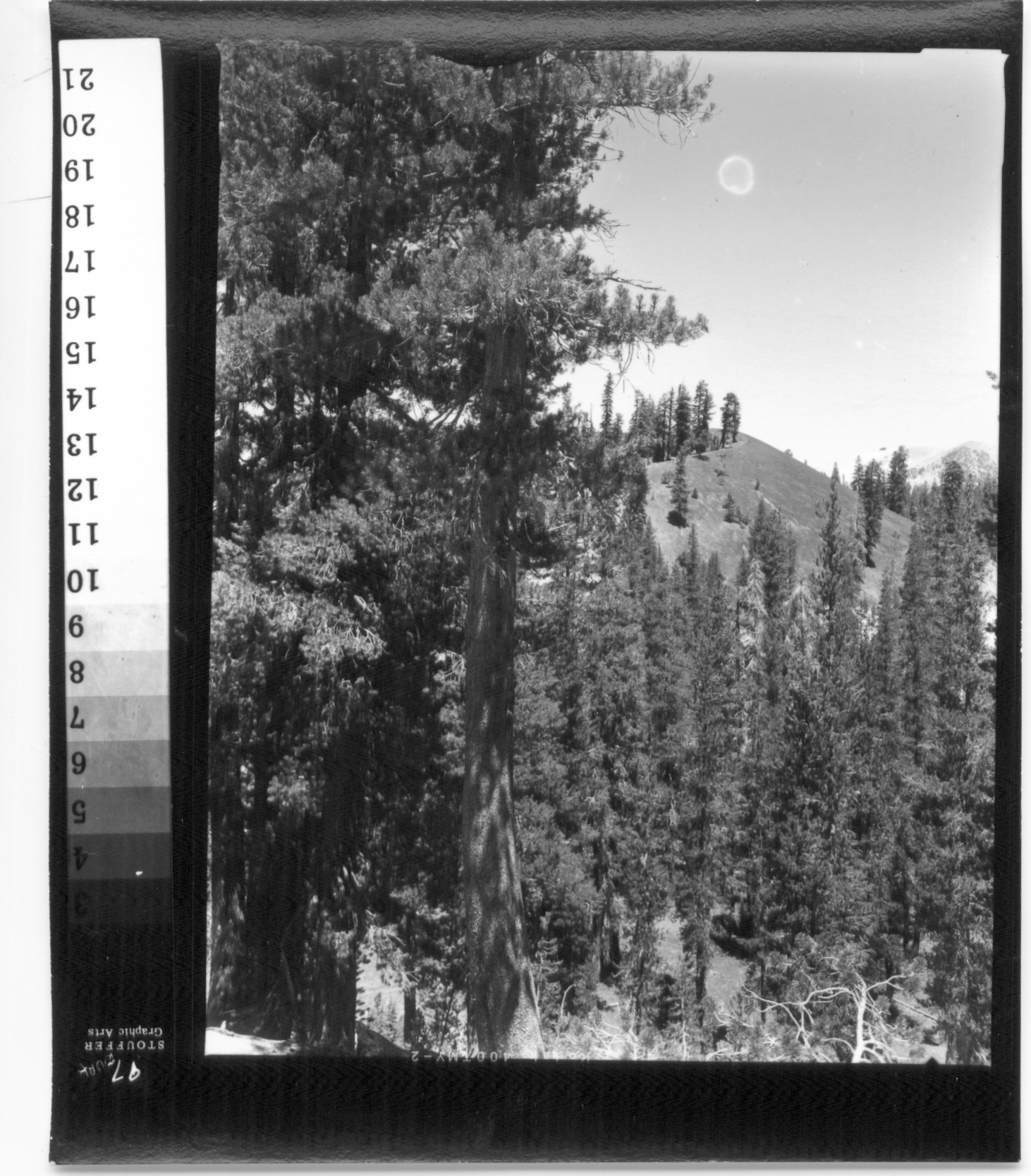
Last night I made some 11x14 prints of a shot from "Red Cones" near "Reds Meadow" that I wanted to share, to illustrate what can be taken near "Thousand Island Lake." I had made a contact print the day before and it looked good wet, it was on the drying screens when I went in to print the enlargements - I didn't even refer to it at first. I had made the contact print with the same height and focus, so flare and optics would be the main difference between contact and enlargement. I made test strips with the same base exposure as my contact print, and selected the same time from the test strip because it looked like a reasonable straight interpretation.
I made an 11x14 and while it was in the fix, I concluded the first print was too light and I chided myself for not making a test strip with exposure above and beyond the expected. I always preach "Lootens" on this so I felt a bit stupid for not having gone over. I pulled out the dry contact print (with test step wedge in the margin) and found that the contact print was rich and full bodied while the print in the fixer was light and weak.
So I did my usual "what you got" and "what you want it to be" comparison of the "Red Cone" earth and decided that a full stop or at least 2/3 stop more exposure was required. Again, not listening to my own teaching, I opened up a stop, backed the time down 1/3 stop and made a full 11x14. (The teaching I didn't listen to was never to make a big change on a full print, do another test strip). Whoa, this one is rich and full-bodied but over the top, too dark.
I made one more 11x14, 1/3 stop less exposure. This time, the print in the fix looked weak and I could barely make out the distant mountain - a tiny feature that looked better on the darkest print.
In the wash I concluded to myself that I didn't nail it, the distant mountain "needed" the darkest time and the rest of the print "needed" to be slightly lighter than the darkest print.
All set to take another stab at it today. Then I looked at the three prints on the drying screens.
Dry-down came to my rescue. The darkest print is the "odd duck out" and the two lightest prints are both acceptable. The distant mountain came down. The print I like best is the one in the middle. When they were wet, I fully expected to reject all three.

 Reply With Quote


Bookmarks