
Michael a nice pair of photographs. Ive gotten to where blue shadows turn me off but these two examples are stunning. The golden dune and blue shadow really set each other off.Originally Posted by Michael Roberts


Michael a nice pair of photographs. Ive gotten to where blue shadows turn me off but these two examples are stunning. The golden dune and blue shadow really set each other off.
--- Steve from Missouri ---
Eliverto, these are great! Love the details in the sand patterns and the sweeping landscapes in the same photos.
One of the things I love about dunes is the overlap with Landscapes and Abstracts, and your photographs capture both aspects.
Last edited by Michael Roberts; 23-Nov-2019 at 09:31.
Thanks, Steve. I know what you mean. I go back and forth on this; I think it just depends on the photograph. I have one from Utah that a printer color corrected because "snow is white, not blue" but in doing so he also left the sky washed out--I'm still bummed about that. If (when) I print that shot again, I'll go back to the uncorrected version which has a nice (to me), red, white, and blue collection of colors.
This morning, I watched the sunrise light turn the snow on the Continental Divide pink--a nice contrast to the aquamarine sky left after the alpenglow faded.
I think you are right about the yellow-blue color contrast; it pumps up the impact more than blue alone would do.
Cycle Poco No. 1 5x7, Arista EDU Ultra 400, Kodak 152mm Anastigmat
no blue

DIY 5x7, 90mm 6.8 Grandagon, Orange Filter, FP4 in PMK, Ilford MG Classic in Moersch Eco developer.
Dunes at Stovepipe Wells: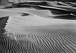
Great work Michael and John
rgds
Andrew
Thanks Andrew. I've been getting great 30x40's from this negative, but am not yet brave enough to go to 40x60 - as there is just a bit of fuzziness in the upper left of the image. Light that day was fading fast, and using an ultra wide lens (for that format) with my hand ground screen...just could not get everything "perfect" quickly enough. Plus I was pooped from having just jogged a couple of miles over soft sand with my gear. Now...with my current Maxwell screen - this would have (I think) gone a bit differently!
Michael...your work inspires me - I've gotta get back to D.V.!
Thanks Andrew and John.
John, your photograph really flows. Great work! Would love to see that printed it 30 x 40. Must be amazing.
Thank you, Michael.
Thx indeed both
rgds
Andrew
 Posting Permissions


 Reply With Quote
Bookmarks