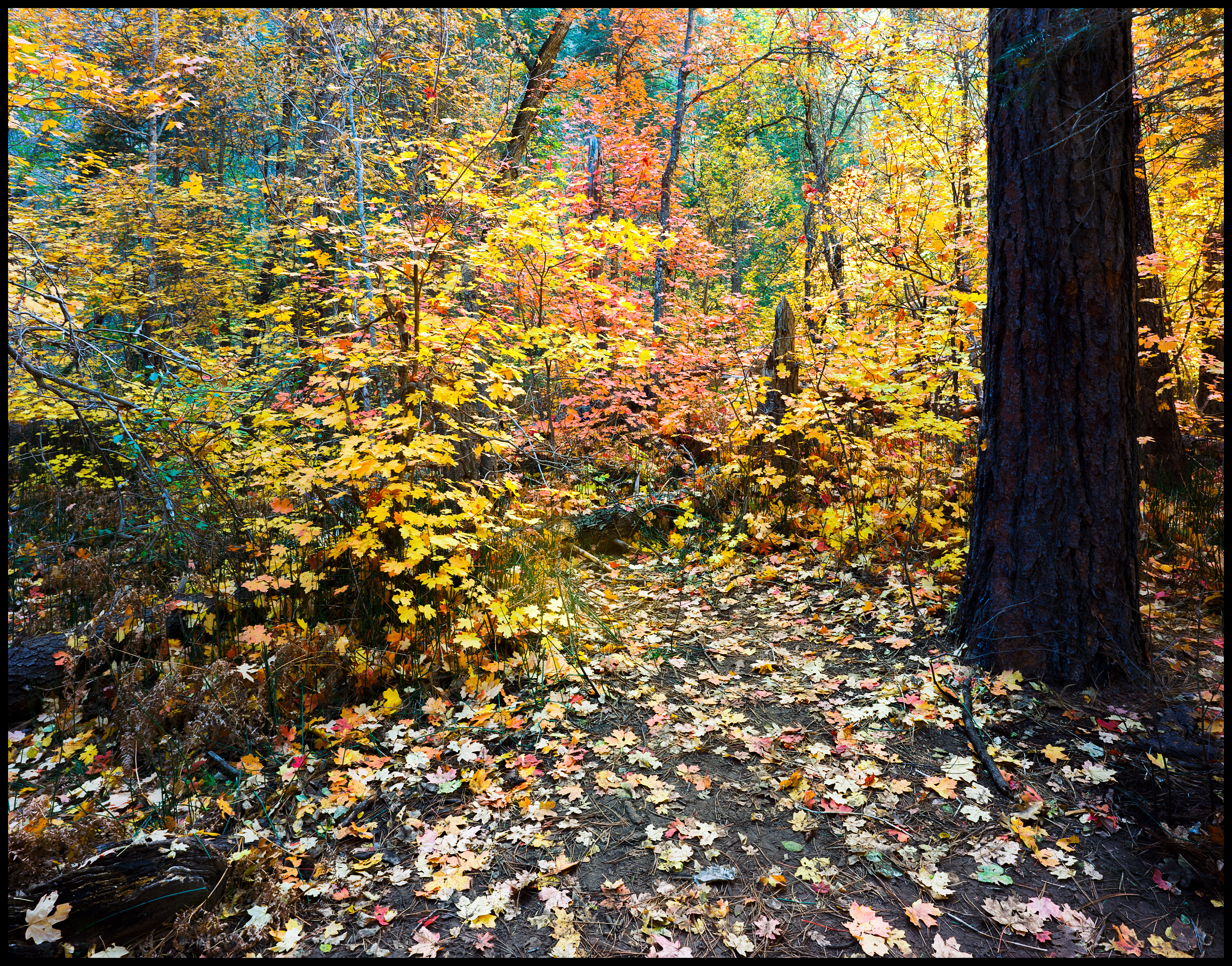
After liking my original image, Peter De Schmidt pointed out a color cast which I hadn't noticed because I liked the way it looked, except for the big tree trunk. Or so I thought. After redoing image from conversion of negative to this, I like this one much better. When you compare to the previous one I posted, it is obvious the cast and flikr makes it worse because for some reason, flikr over saturates images when you upload them. Sharpening was a bit tricky. I did not apply any to the tree trunk as it made it look awful regardless of the amount, but it looks better unsharpened as it is dark to begin with.
[IMG]
 20181027_0129_Working_201891105
 by
Steven Ruttenberg, on Flickr[/IMG]


Originally Posted by Steven Ruttenberg


 Reply With Quote
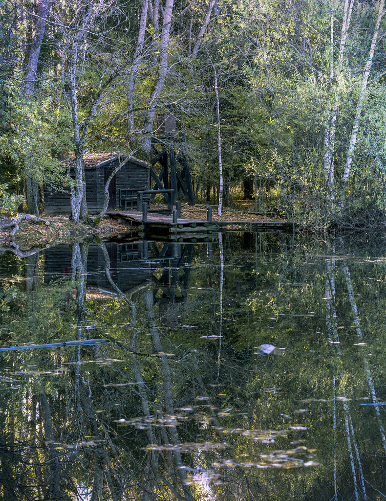


Bookmarks