
I played around with it in PS and was not impressed with it. Looking for more information about exactly what it is for? I don't think of it as a general editing technique especially since you have to convert to 8 bit.


I played around with it in PS and was not impressed with it. Looking for more information about exactly what it is for? I don't think of it as a general editing technique especially since you have to convert to 8 bit
You might find this article helpful: Photoshop Fill Layer: Easy, Non-Destructive, 16 bits per Channel
You can do the same thing in GIMP, using the GIMP Colorize Tool
Any tone you like.
Cool, thanks. I was having a discussion with a friend who swears by the duotone ps function and was complaining that methods like this such as a gradient fill layer per ps was not a tru duo tone. I don't know enough about duotone to say one way or the other.
Duotones, tritones and quad tones or more are really designed for offset lithography where you want a toned black and white (usually) and you only want to print on two or three plates. It's a great tool for that application but has little use for inkjet printing. For offset, the problem is that there is no really accurate way to proof your result and what you get on press may not match your screen. What it does allow you to do is to choose any of the PMS color inks to use and alter the plate curves for each one to achieve your final goal.
Interesting. As some really like it and others don't.

Is it using the the ps duotone feature or something you created?

Duotones in offset lithography can produce fantastic results, especially double black and black/gray duotones. That also goes for tritones and quad tones. It is a process that really should be proofed by the printer, approved by the photographer and matched on press.
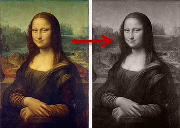
"This gives me a subtle warm tone but keeps whites white - just like I prefer in the darkroom when toning images."
You don't need duotones to do that but it might be easier for you if your Curves skills aren't where they need to be. What people need to realize about duotone is that you're now working with 8 bpc grayscale images and what you see in Photoshop is really just an approximation of what Photoshop thinks your plates are going to print like on press - an approximate soft proof of multiple grayscale channels that represent how a specific (usually) PMS ink is being laid down.
 Posting Permissions

 Reply With Quote
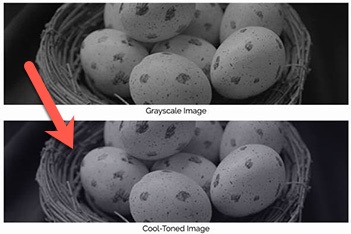
Bookmarks