
Great as always Gudmundur, my wife wants to visit Iceland. I'll Email you about it. LuisOriginally Posted by Gudmundur Ingolfsson


Great as always Gudmundur, my wife wants to visit Iceland. I'll Email you about it. Luis

Steven, Bryan has great advice and a very good eye.
My humble suggestion is to not use the levels on a camera, but just what you see.
I think many of us can 'see' level very well.
Levels with a short axis can't be true.
But I never saw what Bryan clearly did!
Tin Can

On my Chamonix, two of the levels have disappeared, and the others seem way off. I use them for rough leveling and then go by eye. When the missing levels were there, they didn't agree with each other anyway...

I have found the non-agreeing levels to be true as well. I try to use the grids on the gg if I can. Another thought is that I used Nik SilverEfx for the final tweaks on the bw and I am now thinking the adjustments for structure were over done. I need to go back and check on that and try a few other things.

One of the best comments ever.
"I have never in my life made music for money or fame. God walks out of the room when you are thinking about money." -- Quincy Jones
Here is a subtly updated version. I am still on the fence about the rock. I think I am going to leave it and tone it down quite a bit. I like the bush on the right as it is very dark as is the left bottom of the frame so it sort of funnels you into the image from the bottom to the top. As for the rock it is distracting, so I do need to radically tone it down without it becoming garish.
As for the slight blurriness of the image due to the windy conditions that day, it is the mood of the image that drew me to this and the fact it was as sharp as it was given the crazy wind. For me, the mood of the scene is the driver and not how tack sharp or the lack thereof. I think given the way I feel about the image a 16x20 would work as the intent is not being razor sharp, but how it makes you feel. As a side note:
I listened to Vangelis while I worked on the new version. And as strange as this may seem to some, the music brought the image to life and I could feel the mood of the image and how it was affected by the changes I made as well as the ones I undid as I listened to Vangelis.

I do believe too that flickr, zenfolio, etc add a lot of sharpening when you upload. Why, I do not know, but it is evident and quite annoying as you have to watch what you do to your image when it comes to your method of sharpening.
Sometimes we love the subject so much we want to show it all, even when it possibly consists of several photographs.
This version, while reduced from your original, still consists of many parts. It can be a challenge to limit ourselves to just a few components that really work together cumulatively.
Which Vangelis pieces ?
I think Ken's crop provides the basis of a stately "landscape," but for me the charm of the original is its bifurcation between sky and convoluted topography--almost as if we're viewing the process of making a contact print. (3-D printing, indeed.) Otherwise, a couple of other points:
1.) Ken, iirc, would be the authority here, but I think it would be interesting to try a quadtone approach, especially for the foreground.
2.) While you've got a no doubt natural vignette, I'm finding the right side of the frame dark enough to be distracting. Smoothing that out a bit--or even just cropping to 1:2--would help.
[QUOTE=
2.) While you've got a no doubt natural vignette, I'm finding the right side of the frame dark enough to be distracting. Smoothing that out a bit--or even just cropping to 1:2--would help.[/QUOTE]
I have a similar feeling that you have burned in the side and bottom of both sides, which puts the ambient light at odds between the top and bottom; distracting and ? unnatural. but what a great shot!
 Posting Permissions

 Reply With Quote
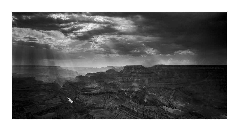
Bookmarks