
I think you will find the pictures in the book are ever so slightly softer than the actual prints. See what you think when you go.


I think you will find the pictures in the book are ever so slightly softer than the actual prints. See what you think when you go.

While briefly thumbing through the book this morning, I was struck with how “soft” or low contrast the images were. I haven't ever printed in Pt/Pl yet but the process is very similar to the Kallitype – at least that is what Christopher sates in his book.. In Kallitype if you under expose a print it looks just that: underexposed; and the negative, of course, should be properly exposed. So it isn't the exposure that results in the low contrast. A soft focus lens does result in a less contrasty print but not that much. My last Kallitype posted in the Kallitype Thread was shot with a Veritar SF lens and while it softens somewhat the image it doesn't lower the contrast t the extent evident in Whites prints in the book. The lighting White used seems very soft and that could account for some of it and there is a ferric oxalate and potassium chlorate contrast control in the process which, in conjunction with the lighting could account for it.
Thomas

I was unable to find in the new book my two Clarence White Camera Work prints to compare contrast or softness.
Your veritar is going to be contrastier than any lens White and his peers used as it's coated. Probably these guys shot meniscus lenses, most famous of which are the Pinkham's. Soft lenses took a further advance in contrast when Struss started flocking the barrel interior: http://www.largeformatphotography.in...l=1#post397825
The style early on was often for what we'd consider very low contrast. Not till modernism picked up steam was contrast celebrated.
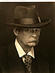
White's first lens was a Taylor, Taylor and Hobson Rapid View Portrait (or R.V.P.) of F11. This from White himself. As Garrett would notice there is a contradiction here. RVP"s were F8. Rapid View (Landscape) 's were F11. Anne McCauley and I debated this a bit and she shared that the Princeton collection also has White's
Taylor Taylor and Hobson RVP EQu. Focus lens, 18-75" no. 16392 (as inscribed on it) and a Pinkham and Smith semi-achromatic 20" lens.
Since most of White's work was early (before teaching) the original F11 lens was the likely one in use.
This is the Cooke at F8
This is the Cooke at F11
and for comparison this is Pinkham and Smith at F8 and F11
Two further things to say
1. Rather than the lens I think the tonal range of much of White's work is in the lighting and printing. He much preferred early dawn and evening shooting sessions.
2. White's negatives are quite sharp were the focus is, which is not always at the plane of the subject.
I agree especially with your first point above. He no doubt shot in soft light and further used chemical processes to lower the contrast to what you see in the prints. Apparently he also used tinted papers. The latter can be duplicated somewhat in the bromoil process by using or combining different colored inks.Originally Posted by cowanw

Thomas
Anybody been to the Davis Museum, Wellesley College exhibition?
Yes, I went and quite enjoyed it.
Robert
Portland Museum of Art, Maine
(06/30/18–09/16/18)
Any experience or comments here?
My 2 Veritars are not coated.
 Posting Permissions

 Reply With Quote
Bookmarks