
Great results! They all capture the atmosphere of the old wet plate technique.Originally Posted by carbo73


's Avatar")
Great results! They all capture the atmosphere of the old wet plate technique.
A couple more wet plates, now experimenting with inside UV led light and both with the MD7 developer by Mammoth.
Camera: Graflex Speed Graphic 4x5
Lens: Kodak Anastigmaf f4.5
Collodion: Franalog Old Workhorse
Developer: Mammuth MD7
Col·lodió d'interior / UV wet plate by SBA73, en Flickr
Les Damm de joventut / Beers of my youth by SBA73, en Flickr
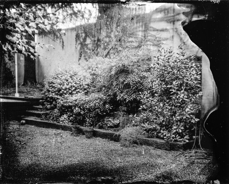
From a 5x7 inch wet plate collodion negative (on glass). Schneider Symmar lens used, not quite wide open.
Old Workhorse developed with UVP copper developer 1:2 for 60 seconds.

Portrait of my son at the studio. Rodenstock 210 App-Sironar W. Quinn's Collodion formula on Aluminum, Osterman Developer Formula and KCN for the fix.
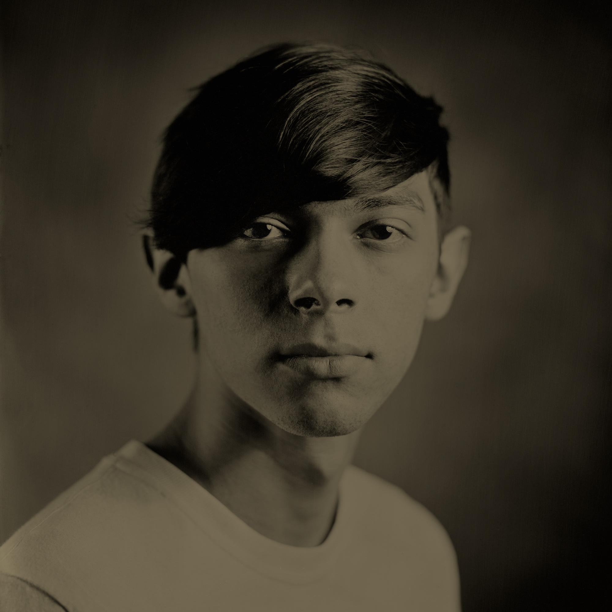
Christopher,
In looking at your portrait image and comparing to a half dozen above it, yours is much darker.
Is this due to the emulsion mix or is it exposure?
Saw a show of 30 or so wet plates by Shane Balkowitsch a few weeks ago. Native Americans on black glass plates. Most pretty clean with few flow marks or glitches. But the whole batch was very dark. A number difficult to see well in the lighting at the gallery. Did not look like "style" but like they all needed more exposure.
Not doing Wet Plate but have seen a bunch and do wonder when all of a photographers work is so dark. Is it a deliberate choice? Lack of experience or training? The emulsion mix? Or underexposure?
Never attribute to inspiration that which can be adequately explained by delusion.

Like!
Interesting light especially the subtle glow around head
Tin Can
Willie, I try to match my scans to the actual plates (using a print viewing booth). I’ve measured the density of blown out hilights on my plates at around 0.78. So, yeah wet plate collodion can easily be 2 stops darker than a print on paper. I imagine that many of the digital representations of plates posted here have been ‘normalized’.
Can't speak for anyone else but I can answer based off my practice: There's two factors that lead to a lot of plates looking pretty dark. First, wet plates take a shocking amount of light to expose. Their sensitivity is usually somewhere between ISO 0.1 and 0.5 for "fast" collodion. So a lot of people simply don't have enough light or realize how long to leave the shutter open because it seems absurd. Second, they're absurdly contrasty. For portraits, to achieve a "normal" look, I find that I need about 2 tenths (0.2) of a stop of difference between the highlight side and the shadow side of the face or else I lose detail in one or the other. On film, I usually go about 1.5 stops difference for the same look. This leads to a lot of people lighting with a normal contrast range, exposing for the highlights, and resulting in really dark shadows. My plates got much better when I finally realized that a 0.1 to 0.2 stop change in strobe power was going to be the difference between a reasonable looking image and a failure.
La Taiadella, Catalunya, agost 2023 by Pau Martín, on Flickr
This is 8x10 tintype, using Jacobson's negative collodion developed with Osterman's standard developer formula. I took it to check the exposure, before shooting some negatives. Fixed with Ilford rapid fixer. The lens was a Fujinon A 300, I think. The place is the chapel at La Taiadella, a XIII century "masia", a fortified farmhouse in Catalonia. Sorry for the funcky colors. The plate is warmer than it looks here.
La Taiadella, Catalunya. Agost 2023. by Pau Martín, on Flickr
This is 8x10 tintype. Like the previous one, I took it to check the exposure. Jacobson's negative collodion with Osterman's standard developer. The lens is an unbranded brass lens, around 215mm, f7, with a nice engraving saying "Verre de Jena". The picture was taken at f22, 6sec. Sorry for the poor iphone pic. The place is La Taiadella, a XIII century "masia" (a fortified farmhouse), which is still inhabited. The country, Catalonia.
 Posting Permissions


 Reply With Quote
Bookmarks