
Hi everyone,
While I'm waiting for night photography to become slighlty more feasible again (!) I thought I'd put up one of my old shots for critique. Not fantastic so any critique would be much appreciated.
Thanks!


Hi everyone,
While I'm waiting for night photography to become slighlty more feasible again (!) I thought I'd put up one of my old shots for critique. Not fantastic so any critique would be much appreciated.
Thanks!
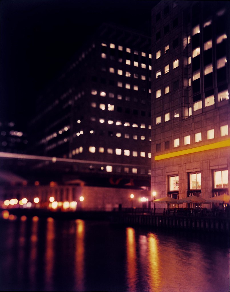
Anyone? Any critique, big or small!
The voyeur in me likes that there is detail in the windows on the nearest building, but I'm a little disappointed that there aren't any in the dark areas on the street. Are there any details in the transparency there? Mostly though, I'm distracted by the out of focus building. Perhaps a swing of the front standard would've made the shot better in my mind, even without shadow detail.
I shoot black and white all the time but have been trying Kodak Ektar and cannot figure out why the colors are so saturated. I know this film is known for its saturation but this is beyond acceptable. I have read on the net that results will be similar to this if the film is greatly overexposed. Has anybody had this issue? I exposed thir pics with the same light meter I do black and white. The neg is scanned with an epson v700 on colour negative with holder setting. I have also had this film developed at different retailers with same results.
These colors are just nasty
thesilverfox - it looks like the colour balance is out on the scan of that image. To my eyes it has a very distinctive blue cast to it. You can see it in the shadows of the trees. You can see it on the whites of the man in the foreground and the plastic tables.
It all depends on how you are scanning and dealing with the digital image, but there are some quick and easy ways to improve those casts. I think if you can pick and set a black, mid grey and a white point, you will see that cast certainly improve.
Ektar is a great film (I have only used it in 35mm and 120) when you get it right, but it is saturated and it can be a pain to get both scanning correctly and the right filter pack if printing optically.
Cheers
PS - happy to show you what approximately 15 secs in Photoshop can do to the image.....
Last edited by hoffy; 15-Aug-2014 at 20:00. Reason: just another comment
Agreed thesilverfox, Ektar is in my opinion closer to fujichrome than it is to something like Portra.. its saturation is pretty wild.
I agree with Hoffy, I just had a quick look at that image in photoshop, there is a definite blue cast throughout and its correctable within a few minutes of very basic processing.
Chamonix 045N-2 - 65/5.6 - 90/8 - 210/5.6 - Fomapan 100 & T-Max 100 in Rodinal
Alexartphotography
Here's a better color balance, and I also raised the luminosity a bit. Took about 20 seconds in Photoshop.Originally Posted by thesilverfox

Thanks Peter. The out of focus areas were intentional (!) but I certainly see that they could divide opinion. As you said, 4x5 gives a great amount of detail, even from a cheap scanner. Anyone else have any critique to offer?

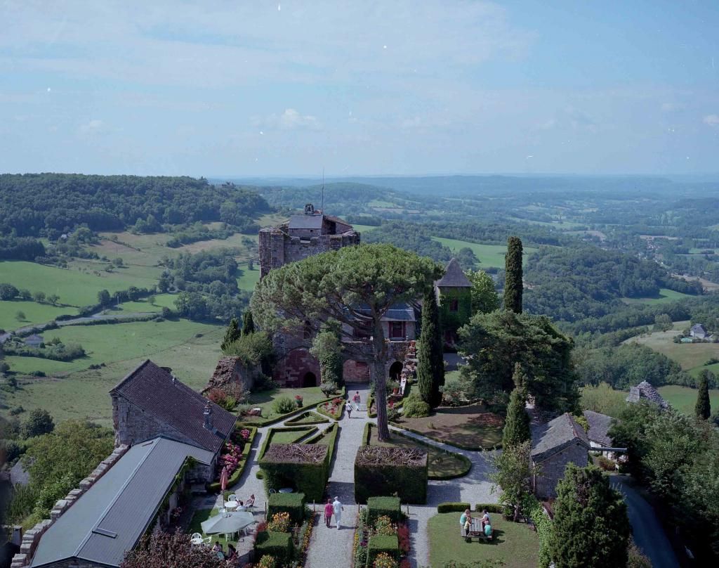
This one over the other. I get a better feel of a 3-D surface than the second one. Both images are perhaps weighted a little low and a little weak (opinion only, thus can change) in the upper left corners. The slight darkening helps a little with the upper one, but my eye has the opportunity to slide off the images in that direction (up and to the left corner). It might be corrected in printing, but I feel that the upper left corners lack the complexity and strength of the other three corners. It is hard to pin down...I am not sure I am saying it correctly (or understandable).
One of the aspects of LF photography I enjoy, is having the time to study each corner and edge of the image on the GG -- I feel that the edges determine greatly how the viewer perceives the image as a whole. Rocks such as these can keep me under the darkcloth making minute changes for a long time! Good luck!
"Landscapes exist in the material world yet soar in the realms of the spirit..." Tsung Ping, 5th Century China
Thanks, Vaughn. I agree with your assessment - something didn't seem quite right to me, but I couldn't put my finger on it.
I may be back there in about a week, in which case I'll try again. The rock is at Harris Beach (near Brookings), not too too far from you...
 Posting Permissions

 Reply With Quote

Bookmarks