
Originally Posted by
Jay DeFehr

Arnaud,
I apologize if my terminology is not very clear, but it's difficult to put my impressions into precise terms -- my failing, not yours. What I mean by thin and flat, is that the skin tones look compressed, without good separation between tones, as if the film was over exposed and under developed. the midtones are not well separated. It's easy to get so preoccupied with adequate exposure, that we expose in a way that makes everything visible, but robs the image of chiaroscuro. I opened the image up in Microsoft Picture Manager (all I have here at work), and adjusted the midtones down considerably (-37), brightness up a little (+3) to compensate for the midtones adjustment, and contrast up a touch (+7), and it looks better on my monitor, but the skin tones still don't look quite as rich as they might.
Jay's portrait is similar to yours in some ways, but look specifically at the skin tones -- how well separated they are. Though there are no deep shadows, there is a sense of depth, volume, and balance that gives the image a richness. I chose this particular image because I think it's successful in every way, and what I aspire to in LF portraiture, and I hope it inspires you, too. I don't know how many LF portraits Jay made before he made this one, but I'll bet it's not his first. I think you're off to a great start, but this stuff is not easy, so please don't be discouraged by my comments, which are only intended to help and encourage you to make more LF portraits! Best of luck, and keep them coming!


 Reply With Quote
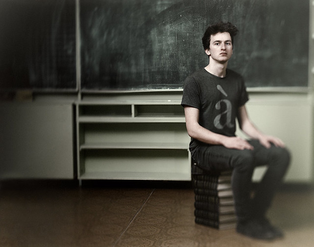


Bookmarks