
I think duplicating it might be a little tricky, and more than 7.5 minutes to get it right. Great!!
I sometimes like the negative better than the positive.....


I think duplicating it might be a little tricky, and more than 7.5 minutes to get it right. Great!!
I sometimes like the negative better than the positive.....
Well it shouldn't take that long on the enlarger, I would hope. It was a dark cloudy day with only natural light when I exposed in camera.
Got a new old camera - 24x30 - changed the lens for a Heliar 36cm and made these paper negs...
Back during week 4 of my 52papernegs project I nabbed this alien invader. Thankfully noone got hurt during the taking of this image.
Alien Invasion - week 4/52
by Don Kittle, on Flickr

I don't see many negatives in the "Paper Negative" thread. Here's one that was never intended to be rendered as a positive:
Adirondack Chairs, Paper Negative
Gelatin-silver photograph on Ilford VC RC photographic paper, image size 19.6cm X 24.4cm, exposed in a Tachihara 810HD triple extension field view camera fitted with a Fujinon-W 300mm f5.6 lens.
Photography:first utterance. Sir John Herschel, 14 March 1839 at the Royal Society. "...Photography or the application of the Chemical rays of light to the purpose of pictorial representation,..".

I like that and a very good reason to shoot with goal of never reversing.
Lovely Wayne, abstract, interesting, engaging. I like the background texture too, all the angles contrasting the curved vase and stem.Originally Posted by Wayne

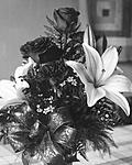
I'm only getting started with paper negatives, so I don't have a good feel yet for how I should be exposing them. I see a lot of really high-contrast stuff with paper but it doesn't seem like it has to be that way. This is pretty much a straight-off-the-scanner reflective scan @ 1800 DPI. Control points added in Silver Efex to get some detail back in the topmost rose but no other adjustments to speak of.
Is there as much variation in paper as there is in film? I'm using Arista EDU paper cut to 4x5 but I'm wondering if using a better Ilford paper might give me different/better results? I'm not completely happy with the contrast yet (it seems quite low compared to a lot of other great images on this thread) so I wonder if I need to try some different paper. I'm afraid to push the curves too much. I'd prefer to get it as close to what I want on the paper first.
It looks good!
which arista.edu paper is it? The lower contrast can be a plus if you plan to make a contact print.


Have any of you ever made colour paper negatives?
YouTube Channel: https://www.youtube.com/user/andy8x10
Flickr Site: https://www.flickr.com/photos/62974341@N02/
Instagram: https://www.instagram.com/andrew.oneill.artist/
 Posting Permissions

 Reply With Quote
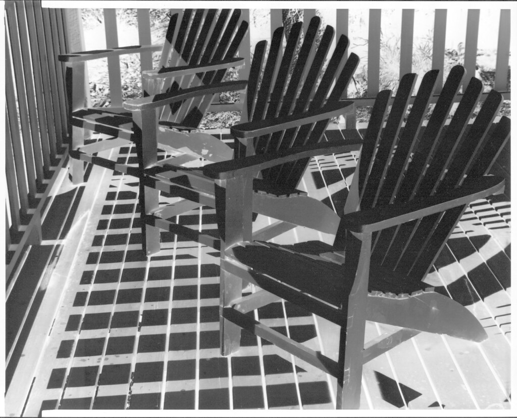
Bookmarks